
Author: TF BDM

  • Measuring the unmeasurable – Using data well to support policy

    People experience homelessness in very different ways, from sleeping rough to families living in overcrowded housing. Capturing those experiences in data is far from straightforward and good policy depends on good evidence. When it comes to homelessness, no single dataset can provide a complete picture. The challenge is not finding one perfect measure, but understanding how different sources can work together to inform better decisions.

    Homelessness is an important social challenge, but is one of the hardest to measure. Alongside the recent Census night in Australia there was discussion about the Census’s role in providing the information needed to design services to meet people’s needs. It’s a valuable data source on many topics, including homelessness. However, the complexities of measuring homelessness mean there is value in considering multiple data sources. Administrative data, street counts, and longitudinal studies can all complement the Census in important ways. The input of people working in, and affected by, the homelessness support system is crucial to helping interpret these sources.

    Homelessness takes many forms, and bringing together different sources of evidence can help to see more of the picture

    Why homelessness is hard to count

    Quantifying homelessness is challenging. Measurement requires first defining what circumstances constitute homelessness, and there is no single definition. There is also no single experience of homelessness. While many people think of homelessness as sleeping rough (a tricky group to count in its own right), modern definitions are broader to include other forms of precarious housing such as crisis accommodation, boarding houses, overcrowded dwellings and temporary stays with family or friends.

    Further, people experiencing homelessness may move frequently between different settings. Stigma, safety concerns and limited contact with services can also make people less visible in official records.

    Understanding different forms of homelessness is challenging but important for policy. A person sleeping outdoors may need a different response from a family living in severe overcrowding, even though both lack secure and adequate housing.

    Different measures tell different stories

    In Australia we use several sources to understand homelessness, and they’re all distinct:

    • The ABS Census estimates the population experiencing homelessness on a particular night. The definition used is fairly broad, including forms of hidden homelessness, such as severe overcrowding and temporarily staying with other households.
    • Specialist Homelessness Services (SHS) data records people receiving support, or seeking support, often across a year or other time period. Importantly, SHS assist people who are currently homeless, but also people who are at risk of homelessness, meaning the assisted population is potentially larger than other counts. It does not capture people who may not seek support through these services.
    • Street counts focus mainly on visible rough sleeping in selected locations, and so only capture a narrow subset. By-name lists are also used to support local coordination and similarly capture a subset.

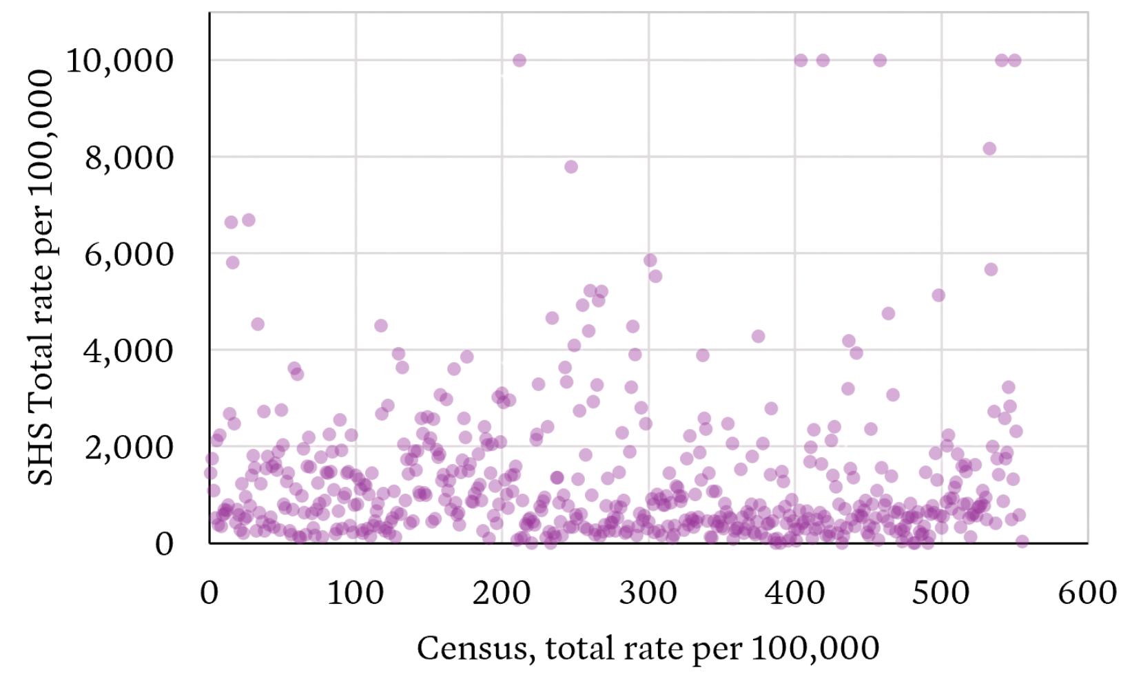
    These measures cannot be expected to match. They use different definitions and consider different time periods. Even when we look across Local Government Areas (LGAs) we see large mismatches in what the different sources tell us. The per capita LGA-level rates show little correlation.

    Source: ABS Census TableBuilder and AIHW SHSC Datacubes

    What the Census captures

    The ABS Census remains Australia’s most comprehensive basis for estimating homelessness because it aims to count the whole population, not only people who access services.

    The 2021 Census estimated 122,494 people were experiencing homelessness on Census night . The estimate covers six operational groups, including people sleeping out or living in improvised dwellings, supported accommodation, temporary stays with other households, boarding houses, other temporary lodgings and severely crowded dwellings. The definition is based adequacy of dwelling, tenure and space for social relations.

    It’s important to note this definition could still be considered narrow, for example it excludes people classified as marginally housed, such as paying rent to live long-term in caravan parks or residential parks with basic amenities.

    Alternative definitions are used elsewhere, including New Zealand, which uses the concept of severe housing deprivation (or lack of access to minimally adequate housing). This consists of four categories: people without shelter, people in temporary accommodation, people sharing accommodation (couch surfing) and people in uninhabitable housing. The measurement of severe housing deprivation primarily uses the Stats NZ Census data with some supplements from providers and administrative data. To determine if individuals are in inadequate housing due to material deprivation, measures of family structure and income are derived from Census responses.

    No measure is perfect, the Census is conducted only every five years, it provides one point-in-time snapshot and can undercount people whose circumstances make enumeration difficult.

    The 2021 results also reflected the unusual accommodation and movement conditions of the COVID-19 pandemic. The 2026 Census results will provide an important update, there are many reasons to think homelessness may have increased with:

    SHS data is also valuable

    Administrative SHS data complements the Census in important ways. The data is collected continuously and so updates are available frequently. It contains homelessness-specific information about clients’ circumstances, needs and assistance. It also allows tracking of repeated service use over time, allowing refined measures, such as persistent homelessness among SHS clients, which can reveal patterns a single-night count cannot.

    However, SHS data also carries large limitations. It does not capture everyone experiencing homelessness. People may not seek assistance, may be ineligible, may face cultural or practical barriers, or may live where suitable services are unavailable.

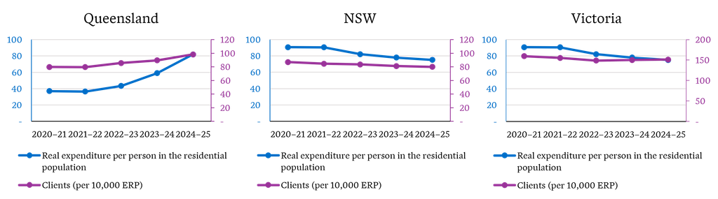
    Crucially, SHS client numbers and services are also shaped by supply. Funding, workforce capacity, eligibility rules, referral practices and geographic coverage affect how many people a service can assist and therefore how many appear in the data. If funding expands, recorded client numbers may rise because more need can be recognised and met. If capacity is constrained, apparently stable client numbers may coexist with increasing homelessness and unmet demand. As an example of how funding influences consider the different picture given by homelessness clients per capita in Queensland, NSW and Victoria alongside expenditure as per the Report on Government Services 2026.

    Source: AIHW Supplementary tables – Historical tables SHSC 2011–12 to 2024–25 and Report on Government Services 2026 – housing and homelessness

    This creates an important interpretation issue. A service-use trend is partly a measure of government and community-sector response, not simply a measure of underlying homelessness. SHS data is therefore indispensable for understanding demand, pathways, support and outcomes, but it should not be used alone to estimate the prevalence of homelessness.

    New Zealand’s move away from Census data

    New Zealand’s Census modernisation makes this distinction especially relevant. Stats NZ is moving away from traditional Censuses and towards an administrative-data-first census, supported by surveys. The approach is intended to rely more on information already collected by government and other organisations, while surveys remain important for validation and for information missing from those records.

    Homelessness is a demanding test case. The 2023 estimate of rates of severe housing deprivation in New Zealand combined Census variables and improved collection strategies to estimate people living without shelter, in temporary accommodation, sharing accommodation or in uninhabitable housing. Stats NZ described these as the best point-in-time estimates available, while acknowledging likely undercounting and a substantial group whose status could not be determined.

    An administrative data first model may improve timeliness, but it also risks making people visible only through their contact with government systems. The New Zealand approach therefore reinforces the need for surveys, tailored enumeration and transparent assessment of coverage gaps.

    No single measure is enough

    The Census provides the best national estimate of how many people are experiencing homelessness at a point in time, while SHS data provides more timely insights into service demand, client needs and pathways through homelessness. Neither source on its own can provide a complete picture.

    An evidence-informed approach to policy needs insights from multiple sources. National datasets can be complemented by longitudinal studies and linked administrative data studies. For example:

    • Journeys Home provide insights into people’s experiences and pathways into and out of homelessness
    • Evaluations of the Aspire Social Impact Bond in South Australia and Housing First programs in New Zealand help us understand longer-term outcomes
    • Our work examining cross-sectoral pathways prior to homelessness in NSW can help identify earlier intervention points across service systems.

    We can also consider proxy indicators, for example social and affordable housing rates, social housing waitlists, rental market indicators as is done by Homelessness NSW. And we need to supplement quantitative analysis with the input of people working in, and affected by, the homelessness support system.

    Ultimately, measuring homelessness is not simply a statistical challenge. Better data leads to better policy, better targeting of services and a stronger understanding of what works. As homelessness pressures evolve, Australia will need to continue investing not only in data collection, but also in monitoring, evaluation and data linkage so long-term impacts of programs and policies can be understood and improved over time.


  • APRA’s latest NCPD data points to an uneven liability market

    APRA’s latest NCPD data points to an uneven liability market

    APRA’s latest National Claims and Policies Database (NCPD) release provides an early view of how professional indemnity and public liability premiums are shifting across the Australian market. Our initial analysis points to five key movements insurers, brokers and insureds should be watching.

    The National Claims and Policies Database (NCPD) provides one of the most comprehensive views of professional indemnity and public liability insurance experience in Australia, drawing on policy and claims data from APRA-regulated general insurers.

    APRA’s latest NCPD release highlights diverging premium movements across Australia’s liability insurance market.

    In this article, we focus on premium movements across the latest policy data. Because gross written premium for an underwriting year continues to develop over subsequent reporting periods, we have projected ultimate premiums for recent underwriting years based on the average development observed in the historical data. As a result, the figures shown may differ from the raw numbers extracted from the database.

    With that context in mind, five movements stand out from our initial review.

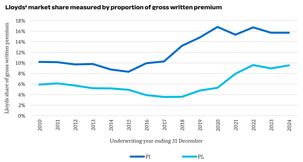
    1. Lloyds market share has been stable over the last three years at 10% for PL and 16% for PI. This followed a period of growth, where they doubled their share of the PL market from 5% in 2020 to 10% in 2024. For PI, they grew from 10% in 2017 to 16% in 2024.

    These numbers are consistent with Lloyds increasing their capacity in Australia. While Lloyds’ market share has remained relatively stable from 2022 to 2024, the greater competition in the Australian market has placed pressure on rates.

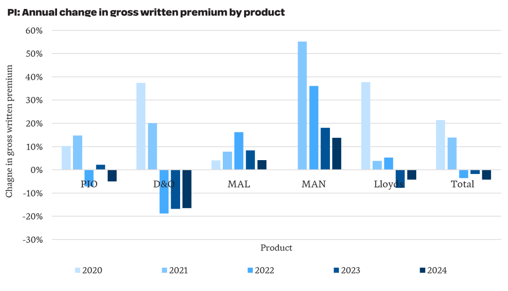
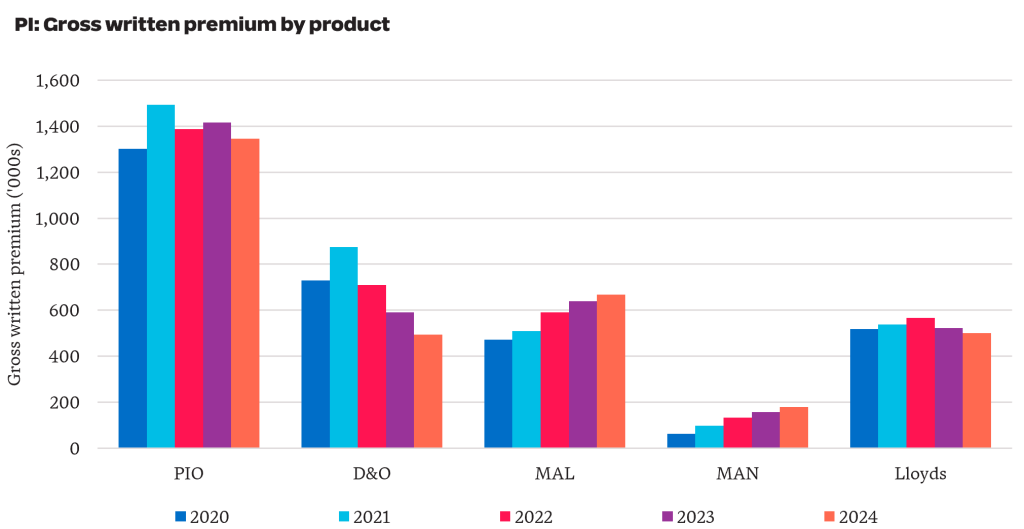
    2. The PI market is soft in aggregate, recording a 4% reduction in GWP from 2023 to 2024. However, the story varies by product, with a 16% reduction for D&O and a 14% increase over the year for management liability.

    Total PI GWP including APRA-regulated and Lloyds reduced from $3.30 billion in 2023 to $3.19 billion in 2024 (-4%). More recent industry data shows this downward rate pressure has continued into 2025 and 2026.

    For business written by APRA-regulated insurers, D&O written premiums reduced by over 40% from $874 million to $493 million since 2021. PIO accounts for 50% of the PI premium written by APRA-regulated insurers and has reduced by 10% from $1.49 billion in 2021 to $1.35 billion in 2024.

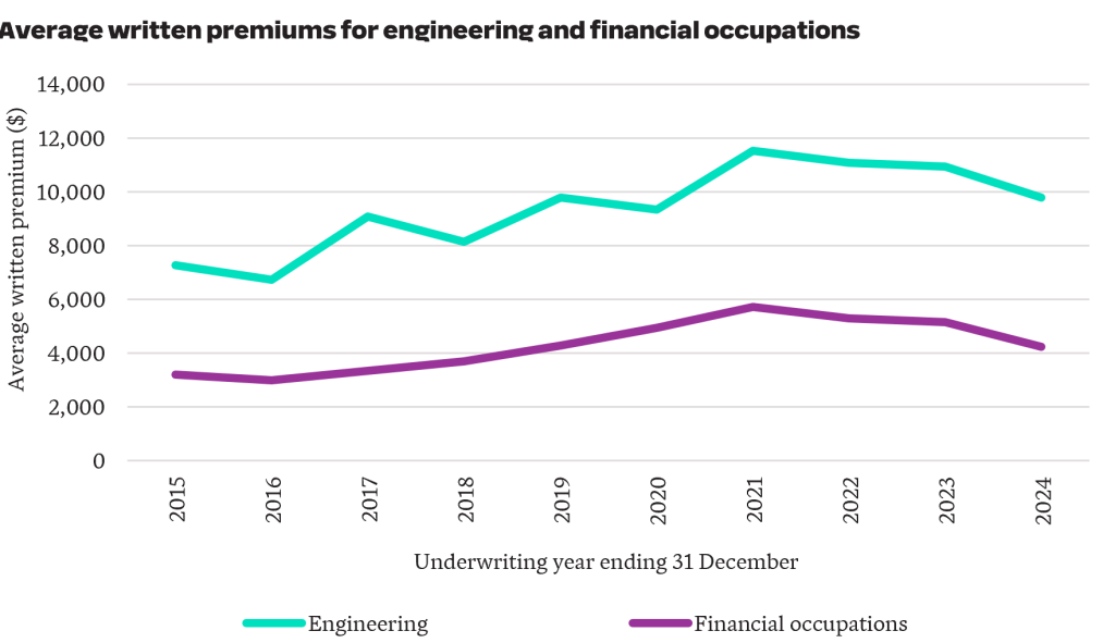
    3. Engineering and financial occupation PI premiums have moderated from COVID-era highs.

    Engineering and financial occupations account for 48% of PIO written premiums. Both professions experienced notable premium increases during the COVID-era, in part reflecting heightened concerns around building defects and combustible cladding for engineers, and the impacts of the 2019 Financial Services Royal Commission for financial occupations.

    The latest data suggests conditions have since eased. The engineering profession experienced a 15% reduction in average written premiums, while financial occupations saw a 26% reduction.

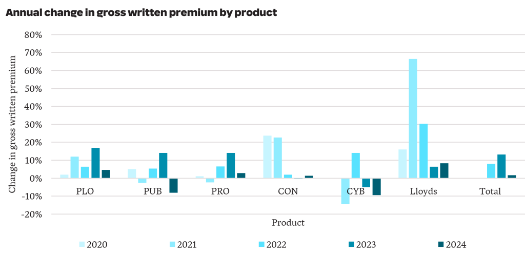
    4. GWP increased by 2% from $3.7 billion in 2023 to $3.8 billion in 2024 for public liability. Results by product were mixed, with Public Liability Other (PLO) increasing by 5% and Cyber reducing by 9%

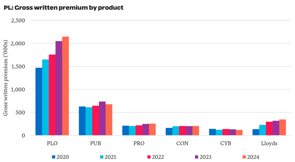
    For business written by APRA-regulated insurers, PLO GWP increased by 46% from $1.5 billion in 2020 to $2.1 billion in 2024 (see chart below). This is on top of a 32% increase in GWP seen over the five years prior. Taken together, GWP nearly doubled between 2015 and 2024. Average premiums have increased materially, driven by increased pressure from worker-to-worker claims, higher legal and litigation expenses and an increase in psychological injuries.

    More recent industry data suggests premiums have started to stabilise in some sectors of the PL market.

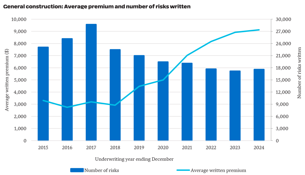
    5. Affordability pressures are evident in the construction sector, with average PL premiums tripling in six years.

    The recent Parliamentary Inquiry into insurance premiums for small businesses has placed affordability under the spotlight. The construction industry was one of the sectors called out for facing increasing insurance costs.

    For General Construction business underwritten by APRA-regulated insurers, average written premium tripled from around $3,000 to over $9,000 in the six years from 2018 to 2024. Over the same period, the number of risks written has reduced by 22% from 22,500 to 17,500.

    APRA’s latest NCPD data points to a liability market that is not moving in one direction. Our initial review highlights areas where premiums appear to be easing, particularly across parts of professional indemnity, alongside sectors where affordability pressures remain acute. As the claims data is examined in more detail, the next question is whether these movements reflect short-term market adjustment or a more sustained shift in risk appetite, capacity and claims expectations.


    Want more analysis on NCPD data?

    We’ll shortly share more insights on APRA’s latest NCPD release as we analyse the latest claims experience.

  • Behind the headline – What May’s CPI data means for insurers and Australia’s insurance market

    Behind the headline – What May’s CPI data means for insurers and Australia’s insurance market

    Australia’s latest CPI data points to a more complex inflation environment for general insurers. Headline inflation has eased slightly, but underlying inflation remains above the Reserve Bank’s target band, while cost pressures in areas directly relevant to home and motor claims continue to build. We explore what the May CPI release means for insurers, with three areas to watch across claims costs, pricing assumptions and household affordability.

    Headline inflation over the 12 months to May 2026 was 4%, down from 4.2% over the 12 months to April 2026. However, trimmed mean inflation* – the Reserve Bank’s preferred measure of underlying inflation – increased by 0.2% over the month to 3.6%, persisting above the 2-3% target band.

    There are a variety of both compounding and offsetting effects flowing through the economy. Fuel/energy costs have increased due to the Iran war, inducing flow-on impacts to other sectors of the economy through increased freight and agricultural costs. Recent policy effects including the fuel excise subsidy and other cost-of-living measures by State and Federal governments have also been influential market forces.

    Fuel prices are a key link between global shocks and local cost pressures.

    What insights can insurers take from the May CPI release? Here are our top three highlights.

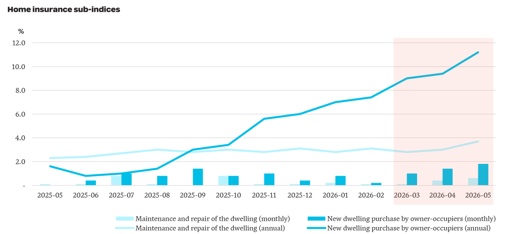
    1. New dwelling costs increased by 11% over the year to May, up from 2% over the year prior. Maintenance and repair cost increases have been more subdued, increasing by 4% over the year to May, up from 2% over the year prior.

    Inflation for maintenance and repair costs of dwellings and new dwelling purchases

    The new dwelling purchase series (blue series) includes changes in building materials costs and labour costs. This index has increased steadily from November 2025, outpacing the increase in maintenance and repair costs (light blue series). The double digit increase in new dwelling costs aligns with increased competition for skilled tradespeople and construction materials, with greater demand continuing to push prices higher.

    There are early signs effects from the conflict in the Middle East is flowing through to higher new dwelling costs, as seen in the shaded orange region in the chart. Inflation over the months of April 2026 and May 2026 was 1.4% and 1.8%, respectively. This compares with 1.2% and 0% over the same months last year. Month-to-month inflation figures are volatile and are to be treated with caution.

    As maintenance and repair costs and the cost of new dwellings are subject to different inflationary pressures, insurers will need to closely monitor the mix between partial and total losses.

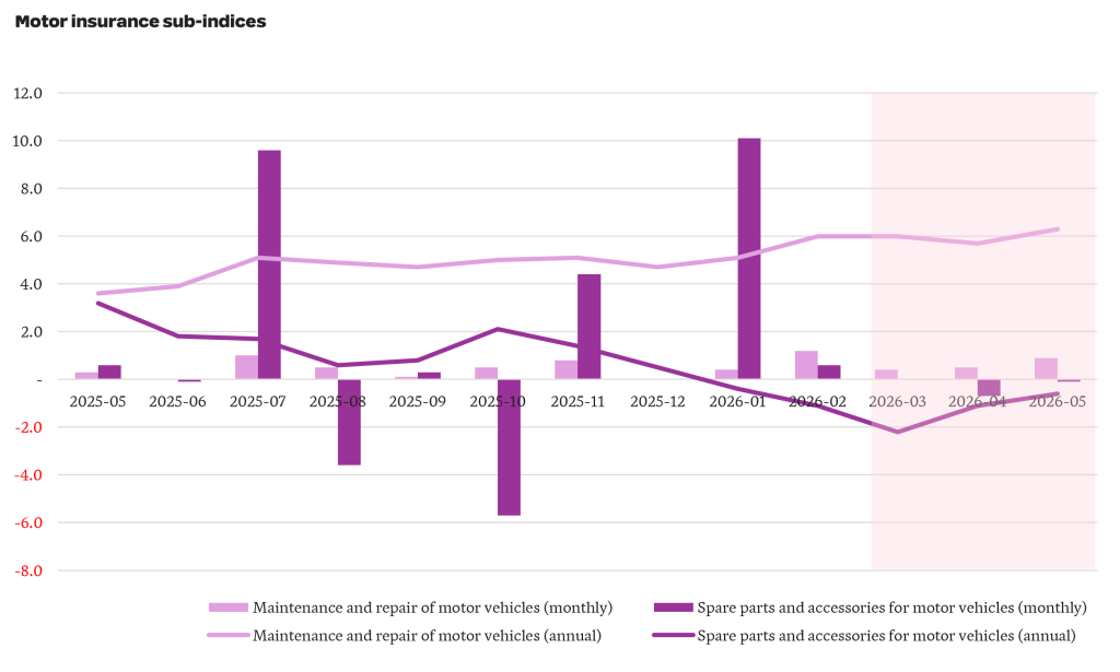
    2. The cost of maintaining and repairing motor vehicles has increased by 6% over the last year, up from 4% the year earlier.

    Inflation for maintenance and repair costs of vehicles and spare parts and accessories for vehicles.

    The cost of maintaining and repairing a motor vehicle (light purple series) has grown faster than the broader CPI and has increased through FY26. This series captures the cost of labour, parts and materials, with the increase over the year attributable to both rising labour costs and vehicle complexity. Over the same period, the cost of spare parts and accessories (dark purple series) has declined by 0.6%.

    Motor insurers should be cognisant of growing labour and repair complexity costs which have outstripped general inflation. We expect this trend to persist as electric vehicle penetration continues to accelerate (see our recent article on EVs for more details), requiring more specialised skillsets and parts.

    3. Consumers are continuing to feel the squeeze. Since the start of 2024, prices as measured by the CPI have increased by 11% to the end of March 2026. Meanwhile, wages, as measured by Average Weekly Earnings, have only increased by 8% meaning that real wages have declined by 3% over the period.

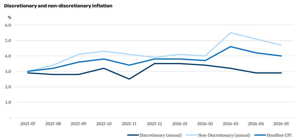
    This is only part of the picture. May CPI data shows the cost of non-discretionary items has increased faster than discretionary items. Non-discretionary items are goods and services which are purchased to meet a basic need – for example, food, shelter and healthcare. Discretionary items are those which are considered “optional”, such as takeaway meals, alcohol and holidays. The chart below highlights non-discretionary inflation has been persistently higher than discretionary inflation over FY26 and consequently, is also higher than headline CPI inflation.

    Increases in the cost of non-discretionary items have a larger impact on lower-income households as these essentials cannot be easily deferred or substituted as household budgets tighten. Following the Middle East conflict, non-discretionary inflation has spiked up to the 5%, driven by increases in automotive fuel prices. As a result, low income households are facing more pressure than implied by the headline inflation numbers.

    Cost of living has been of substantial focus in recent years, particularly politically where the government has introduced measures to offset part of the impact of rising prices. For example, the Fair Work Commission’s decision to increase the National Minimum Wage by 6% is expected to go part way to addressing some of these pressures for the lowest paid workers.

    What do the latest numbers mean for the insurance industry?

    1. The pressure on affordability is intensifying. Broader cost of living pressures, combined with higher-than-average levels of inflation in home and motor repair costs which will increase premiums, will squeeze already-tight household budgets.
    2. As the status of the conflict in the Middle East changes regularly, so too do inflation expectations. We are only now starting to see the impacts of higher fuel prices flow through to the cost of materials. Even if the conflict ends tomorrow, expectations are that it will take over six months for things to return to normal. This will have implications for pricing and reserving.
    3. Financial vulnerability is expected to increase and will impact renewal rates, selected excesses and sums insured.

    The May CPI release reinforces that insurers are operating in an environment where inflationary pressure is uneven, volatile and closely tied to household affordability. For insurers, the challenge is not only to respond to current inflation, but to track how these pressures flow through portfolios over time and adjust pricing, reserving and risk settings as new trends emerge. Additionally, insurers will need to closely monitor the impact of affordability pressures on their portfolios so their products align with customer needs to maintain relevance, trust and resilience.

    *The trimmed mean removes the most extreme price movements.  

  • Catastrophic injury care – the hidden cost of e-bike adoption

    Catastrophic injury care – the hidden cost of e-bike adoption

    As fuel prices rise, more households are turning to e-bikes to manage transport costs. This shift brings a less visible consequence – a higher risk of serious injury and the long-term cost of care for injury schemes. Australian data on e-bike injuries remains fragmented, which makes it difficult for scheme regulators to judge the scale of emerging exposure. We estimate how recent growth in e-bike adoption could affect the incidence and cost of catastrophic injury care in Australia.

    Although e‑bike adoption in Australia has lagged Europe and parts of Asia, e‑bikes are increasingly viewed as a cost‑effective alternative to car ownership and a more environmentally sustainable mode of transport. Improvements in battery technology, expanding retail availability, and rebate programs in several jurisdictions have further supported uptake.

    As e-bike use grows, so does exposure to long-term injury care costs.

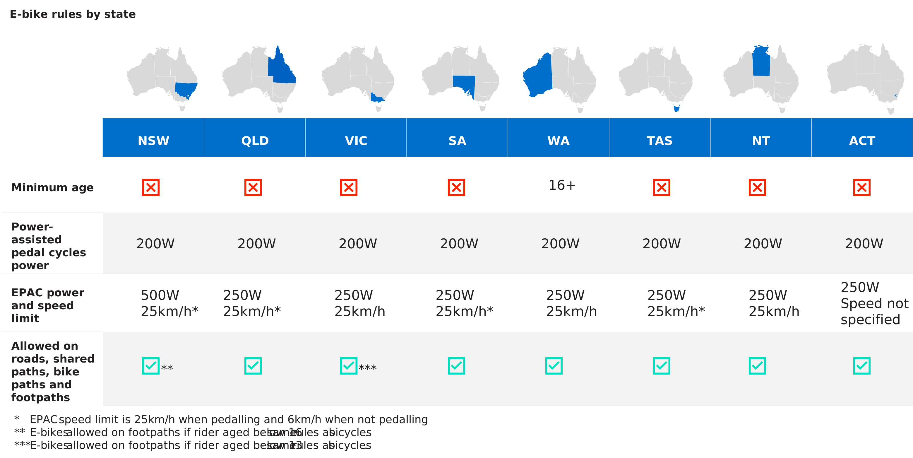
    In Australia, the use of e-bikes is restricted. Most jurisdictions only permit use of power‑assisted pedal cycles (generally limited to 200 W) and electrically power‑assisted cycles (EPACs, generally limited to 250 W). Helmet use is mandatory throughout Australia, but minimum age restrictions are limited.

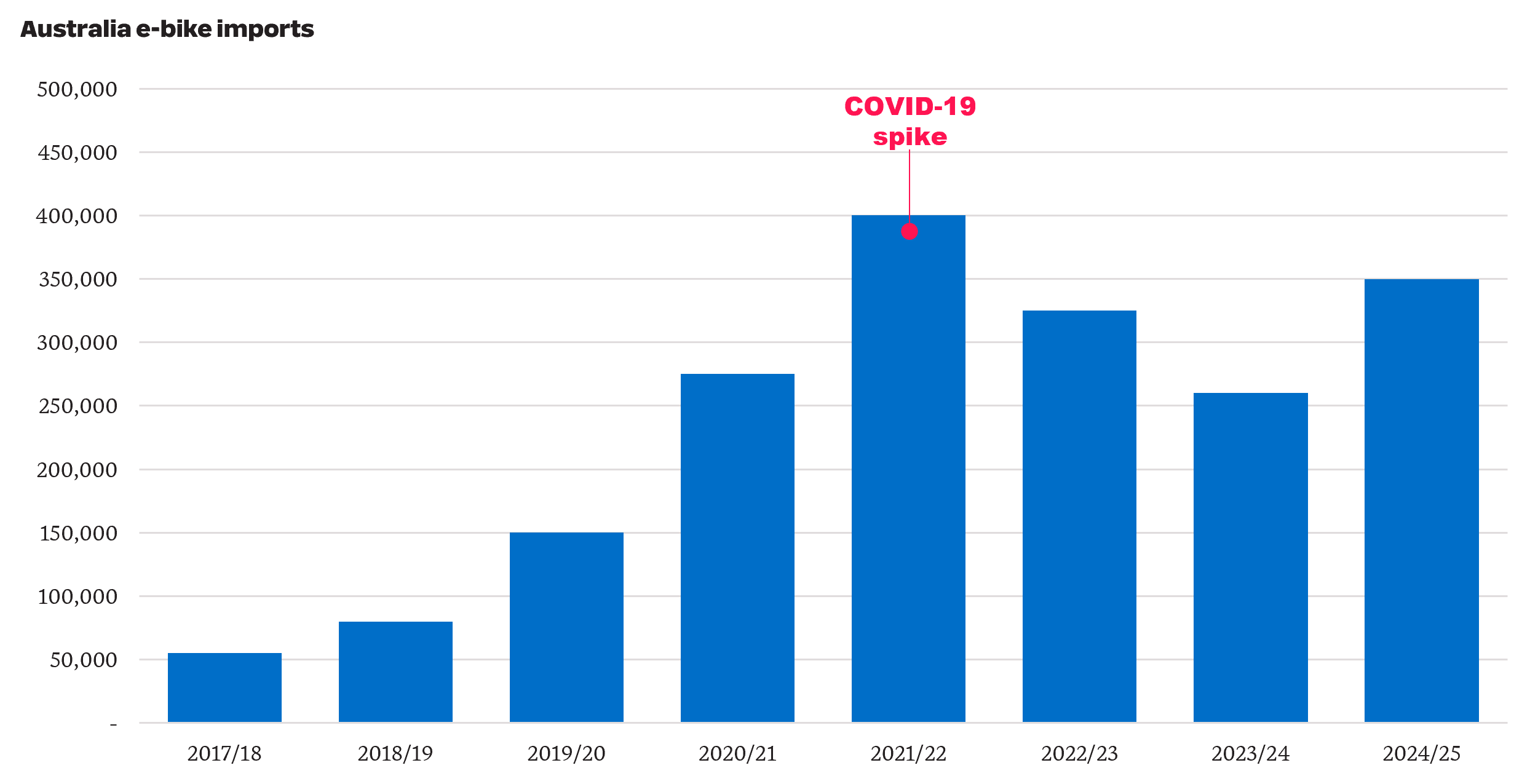
    Official national sales data is not available, as e‑bikes do not require registration or licensing in Australia. However, industry reports indicate annual sales increased from approximately 9,000 units in 2017 to around 254,000 units in 2025. Import data showed a similar pattern, with e‑bike imports rising from approximately 55,000 units in 2017/18 to around 350,000 units in 2024/25. The number of e-bikes imported spiked to 400,000 in 2021/22, coinciding with the COVID‑19 pandemic, when commuters sought transport modes which enabled greater social distancing.

     Historical e-bikes imported into Australia grew rapidly and remain at high levels.

    As e‑bike adoption has increased, reported injuries associated with their use have also risen. Contributing factors cited in media reports include higher operating speeds (including illegal modifications), alcohol use and low rates of helmet use.

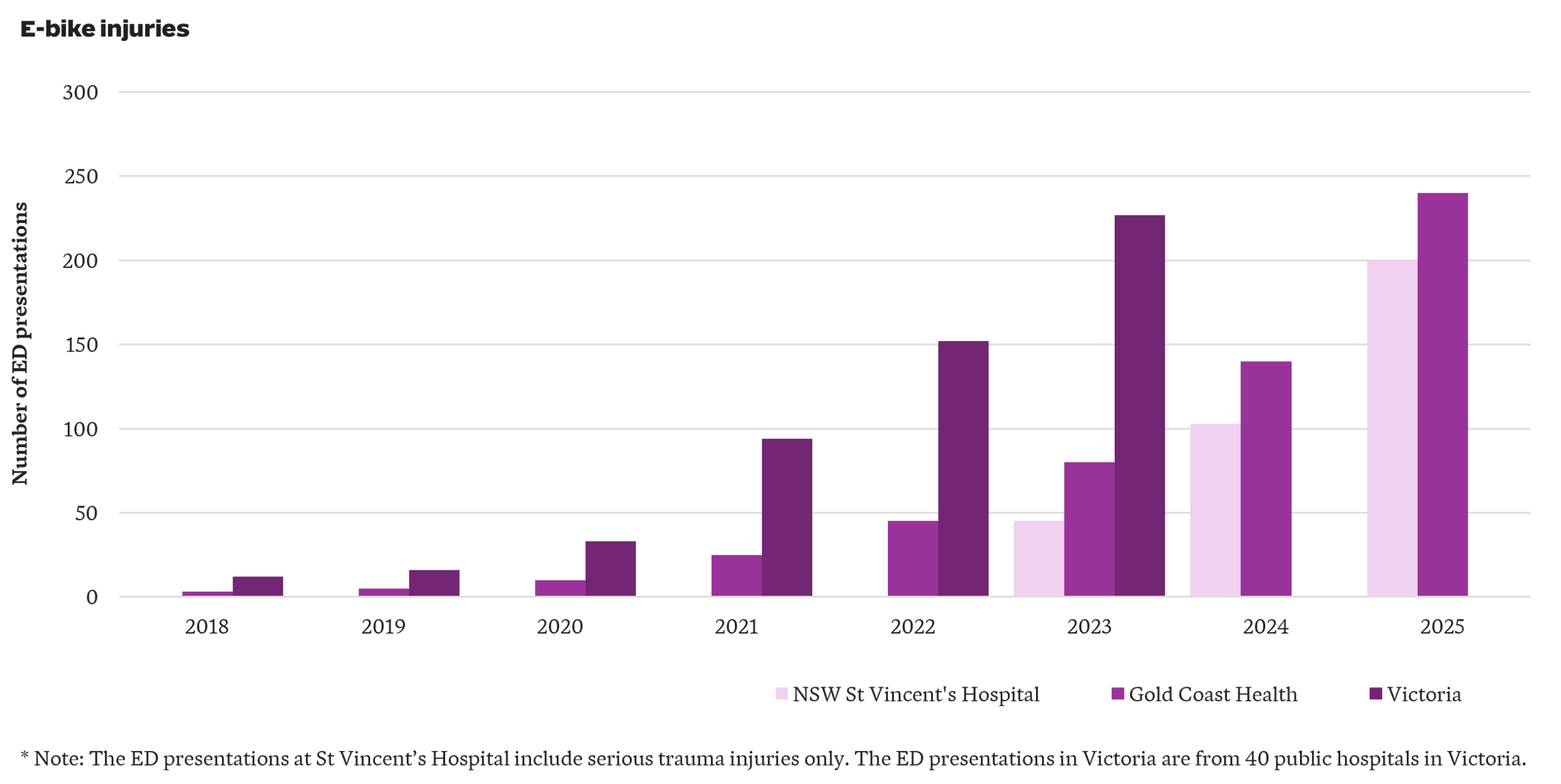
    Australian data on e‑bike injuries is fragmented and incomplete, with e‑bike injuries often grouped with those from other micromobility devices e.g. e-scooters. Despite these limitations, available data consistently indicate strong growth in injuries over time – shown  by growth in emergency department (ED) presentations observed at St Vincent’s Hospital (NSW), Gold Coast Health (QLD) and Victoria.

    The number of e-bike injuries in Australia has increased significantly over recent years.

    Although rising e-bike injuries impose costs on society, who ultimately bears those costs depends on how the injury occurs. In general:

    • For single-vehicle accidents, such as falls from e-bikes, the injured rider may be able to claim through private insurance, including personal accident, income protection or private health cover. If the accident occurs on private property, the rider may also be able to claim under the property owner’s home insurance.
    • If a pedestrian is injured by an e-bike, they may be able to seek compensation from the rider or the rider’s public liability insurance policy where the rider was at fault. Otherwise, they may need to rely on private insurance, similar to the case of a single-vehicle accident.
    • If an e-bike rider is injured in the course of work, they may be able to claim workers compensation.
    • If an injury arises from the use of a permitted shared e-bike, compensation may be available under the provider’s insurance policy. Once the provider’s policy limits have been exhausted, in some jurisdictions and in some instances costs may be met through the motor accident injury scheme (e.g. the Motor Accidents Compensation Scheme in the Northern Territory).
    • If an e-bike is involved in a crash with a motor vehicle, the injured user may be able to claim against the motor vehicle driver’s compulsory third party (CTP) insurer. If the injuries are catastrophic, the injured user may qualify for entry into a motor accidents lifetime care scheme.

    Insurers and injury schemes bear only part of the overall cost of e-bike injuries. Where compensation is available through CTP or workers compensation, entitlements vary significantly by jurisdiction. All Australian jurisdictions provide support for the treatment, rehabilitation and care costs of people who are catastrophically injured in accidents involving a motor vehicle – and the cost of providing this support is likely to be broadly similar across jurisdictions. These are the most expensive injuries, and so we focus on projecting the indicative cost of these over the next decade.

    Projection assumptions

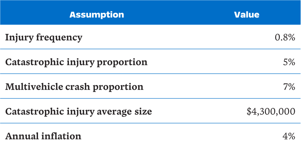
    We make the following assumptions to project the cost of e-bike catastrophic injuries in Australia, discussing each in turn:

    Injury frequency

    We define injury frequency as Emergency Department (ED) presentations relative to the number of e-bikes owned privately. We have excluded shared e-bikes from the exposure measure as their numbers are relatively small (approximately 25,000 compared to 1 million privately-owned e-bikes). Based on available state level data, estimated injury frequencies ranged from around 0.4% to 1.3% per bike per year, broadly consistent with international experience in high uptake countries such as the Netherlands (0.6% to 0.7%). We have adopted an injury frequency of 0.8%.

    Catastrophic injury proportion

    Of greatest cost is the subset of injuries which are catastrophic, i.e. traumatic brain injuries (TBIs) and spinal cord injuries (SCIs). Australian and international evidence on injury severity is mixed:

    • A study from Victoria found intracranial injuries accounted for around 4% of e-bike injuries whilst a Queensland study found TBIs represented around 8% of ED presentations from e-mobility devices (primarily e-scooters).
    • Studies from the Netherlands reported substantially higher proportions of TBIs among e-bike injuries, ranging from 15% to 29%. Another study of younger patients found TBIs in 38% of e‑bike injuries.
    • Studies from the United States suggested TBI represented 29% to 54% of e-bike injuries and spinal fractures represented 11%.

    The higher TBI proportions in the international studies likely reflect non-mandatory helmet wearing and higher permitted speed and e‑bike power. Relying on the Victorian study, we assume 5% of e-bike injuries are catastrophic (comprising approximately 4% TBIs and 1% SCIs) to project the number of catastrophic injuries.

    Multi-vehicle crash proportion

    We estimate the proportion of injuries involving collisions with motor vehicles to project the number of catastrophic injuries eligible to enter (motor accidents) lifetime care schemes. One Australian study suggested around 6% of e-bike injuries involved collision with a car, compared to materially higher proportions overseas, which may be explained by differences in traffic conditions. Relying on the Australian study and allowing an additional 1% for crashes with non-car vehicles, an indicative assumption of 7% was adopted.

    Catastrophic injury average size

    The lifetime cost of providing treatment and care support for a catastrophically injured person is significant and can vary widely depending on injury type, severity, age and the availability of informal care. SCIs are generally more costly than TBIs, and injuries to younger claimants result in higher lifetime costs. Based on our experience across Australian lifetime care schemes, we have assumed an average cost of around $4.3million (in June 2025 dollars).

    Annual inflation rate

    We have made an allowance for treatment and care costs to increase at 4% per annum, recognising both normal cost inflation and the tendency for attendant care costs and medical expenses to increase at a higher rate (i.e. superimposed inflation).

    Projection scenarios

    To estimate the future cost of catastrophic e-bike injuries, we apply the above assumptions to three indicative scenarios of private e-bike usage (a base scenario and two alternative scenarios of increased usage). The scenarios are illustrative rather than exhaustive – actual outcomes may fall outside the range of these indicative estimates.

    The base scenario assumes e-bike sales grow at 9.4% per annum, increasing from approximately 289,000 units in 2026 to more than 650,000 units by 2035 (based on forecasts from a market research company). We assume replacement (as e‑bikes reach the end of their usable life) every four years on average.

    To illustrate the potential impact of increased e-bike usage, we constructed two alternative scenarios for comparison to the base scenario:

    • Scenario A (temporary sales increase): Sales in March to June 2026 are assumed to be double what they were in the same period in 2025. From 2026/27 onwards, annual increases in unit sales are equal to the base scenario.
    • Scenario B (persistent sales uplift): Sales in March to June 2026 are assumed to be 150% higher than the same period in 2025. From 2026/27 onwards, sales grow 1% higher than the base scenario i.e. at 10.4% per annum.

    These indicative scenarios attempt to reflect a more recent surge in the purchase of e-bikes. Australia’s largest bicycle retailer reported a 136% increase in sales in late March 2026 compared to the same period in the previous year. This increased take-up is likely in part due to increased fuel prices (up by approximately 40% to 70% in March and April 2026) and temporary fuel shortages reported in some regions, following the outbreak of the Iranian conflict.

    Our illustrative projections show:

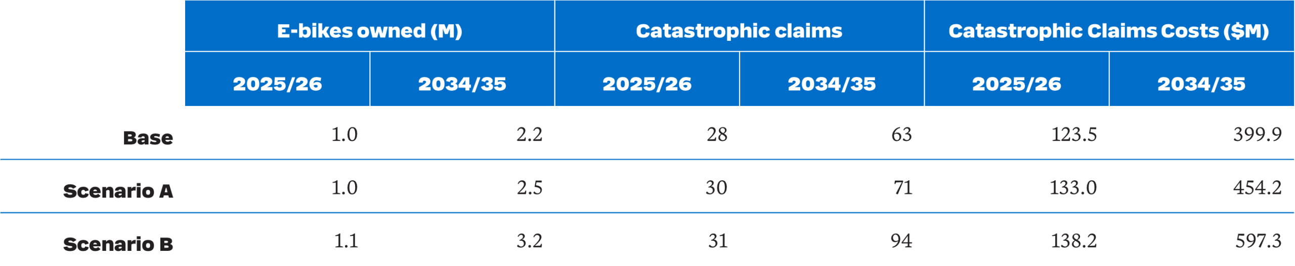
    • Ownership projected to increase from approximately one million units in 2025/26 to 2.2 million, 2.5 million and 3.2 million units by 2034/35 under the base scenario and Scenarios A and B respectively.
    • The number of eligible catastrophic e-bike injury scheme participants projected to more than double from 28 in 2025/26 to 63 in 2034/35 under the base scenario.  By 2034/35, participants under Scenarios A and B are projected to be 71 and 94, or 13% and 49% above the base scenario.
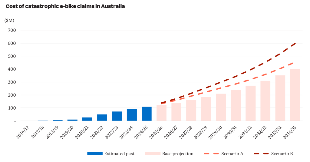
    • Catastrophic e-bike injury costs incurred projected to more than triple from $124 million 2025/26 to $400 million in 2034/35 under the base scenario. Under Scenarios A and B, costs are projected to increase further (to $454 million and $597 million, respectively).
    • The projected increase in e-bike use may be partially offset by substitution effects (i.e. a reduction in the number and cost of injuries associated with other road users, such as cyclists and motorcyclists).
    Catastrophic e-bike injury claims costs in Australia are projected to escalate over the next decade.

    There is recent evidence of further upward risk on costs. Data from the Sydney Children’s Hospital Network shows children presenting with e‑bike injuries increasing sharply from 33 cases in 2023 to 94 cases in 2025. Kidsafe Victoria reported a 61% increase in emergency department presentations among children aged 2 to 18 from 2023/24 to 2024/25. Catastrophic claims involving children tend to be materially more expensive, but we have not reflected this in our illustrative projections.

    Regulation and policy are evolving

    Regulatory settings are evolving rapidly and will influence future injury patterns. In recent years, growing concern has emerged about the safety impacts of increasing e-bike use, prompting regulators to introduce several regulatory changes. For example:

    • In December 2025, the Commonwealth government reinstated the adoption of EN 15194 as the absolute national reference standard for e-bike imports.
    • In NSW, proposed reforms include the introduction of a minimum rider age, a reduction in permitted e-bike power from 500W to 250W, and new enforcement powers allowing police to seize and destroy illegal e‑bikes.
    • In Queensland, reforms include the application of a minimum rider age, restriction in speed on footpaths, requiring e‑bike riders to hold a valid driver’s licence, and giving police power to seize and dispose of non-compliant e-bikes. Devices with higher power/speed will be reclassified as mopeds or motorcycles, triggering registration and insurance requirements.

    This evolving policy environment represents an additional source of uncertainty around future cost experience.

    Overall, while e-bikes deliver benefits, catastrophic injury exposure is no longer a marginal issue. The fuel price shock associated with the Iran conflict may accelerate adoption further, bringing risks forward. Australia currently lacks a uniform national framework for e-bike regulation and data collection, which makes analysis difficult. Improved data collection, ongoing monitoring and coordinated policy responses will be essential to manage these emerging costs before they become entrenched – and substantially more expensive.