

Category: Uncategorized

  • Measuring the unmeasurable – Using data well to support policy

    People experience homelessness in very different ways, from sleeping rough to families living in overcrowded housing. Capturing those experiences in data is far from straightforward and good policy depends on good evidence. When it comes to homelessness, no single dataset can provide a complete picture. The challenge is not finding one perfect measure, but understanding how different sources can work together to inform better decisions.

    Homelessness is an important social challenge, but is one of the hardest to measure. Alongside the recent Census night in Australia there was discussion about the Census’s role in providing the information needed to design services to meet people’s needs. It’s a valuable data source on many topics, including homelessness. However, the complexities of measuring homelessness mean there is value in considering multiple data sources. Administrative data, street counts, and longitudinal studies can all complement the Census in important ways. The input of people working in, and affected by, the homelessness support system is crucial to helping interpret these sources.

    Homelessness takes many forms, and bringing together different sources of evidence can help to see more of the picture

    Why homelessness is hard to count

    Quantifying homelessness is challenging. Measurement requires first defining what circumstances constitute homelessness, and there is no single definition. There is also no single experience of homelessness. While many people think of homelessness as sleeping rough (a tricky group to count in its own right), modern definitions are broader to include other forms of precarious housing such as crisis accommodation, boarding houses, overcrowded dwellings and temporary stays with family or friends.

    Further, people experiencing homelessness may move frequently between different settings. Stigma, safety concerns and limited contact with services can also make people less visible in official records.

    Understanding different forms of homelessness is challenging but important for policy. A person sleeping outdoors may need a different response from a family living in severe overcrowding, even though both lack secure and adequate housing.

    Different measures tell different stories

    In Australia we use several sources to understand homelessness, and they’re all distinct:

    • The ABS Census estimates the population experiencing homelessness on a particular night. The definition used is fairly broad, including forms of hidden homelessness, such as severe overcrowding and temporarily staying with other households.
    • Specialist Homelessness Services (SHS) data records people receiving support, or seeking support, often across a year or other time period. Importantly, SHS assist people who are currently homeless, but also people who are at risk of homelessness, meaning the assisted population is potentially larger than other counts. It does not capture people who may not seek support through these services.
    • Street counts focus mainly on visible rough sleeping in selected locations, and so only capture a narrow subset. By-name lists are also used to support local coordination and similarly capture a subset.

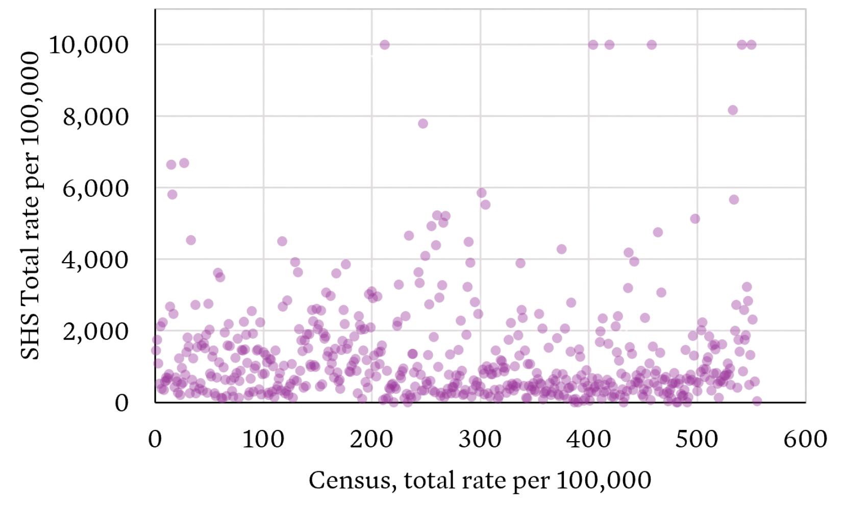
    These measures cannot be expected to match. They use different definitions and consider different time periods. Even when we look across Local Government Areas (LGAs) we see large mismatches in what the different sources tell us. The per capita LGA-level rates show little correlation.

    Source: ABS Census TableBuilder and AIHW SHSC Datacubes

    What the Census captures

    The ABS Census remains Australia’s most comprehensive basis for estimating homelessness because it aims to count the whole population, not only people who access services.

    The 2021 Census estimated 122,494 people were experiencing homelessness on Census night . The estimate covers six operational groups, including people sleeping out or living in improvised dwellings, supported accommodation, temporary stays with other households, boarding houses, other temporary lodgings and severely crowded dwellings. The definition is based adequacy of dwelling, tenure and space for social relations.

    It’s important to note this definition could still be considered narrow, for example it excludes people classified as marginally housed, such as paying rent to live long-term in caravan parks or residential parks with basic amenities.

    Alternative definitions are used elsewhere, including New Zealand, which uses the concept of severe housing deprivation (or lack of access to minimally adequate housing). This consists of four categories: people without shelter, people in temporary accommodation, people sharing accommodation (couch surfing) and people in uninhabitable housing. The measurement of severe housing deprivation primarily uses the Stats NZ Census data with some supplements from providers and administrative data. To determine if individuals are in inadequate housing due to material deprivation, measures of family structure and income are derived from Census responses.

    No measure is perfect, the Census is conducted only every five years, it provides one point-in-time snapshot and can undercount people whose circumstances make enumeration difficult.

    The 2021 results also reflected the unusual accommodation and movement conditions of the COVID-19 pandemic. The 2026 Census results will provide an important update, there are many reasons to think homelessness may have increased with:

    SHS data is also valuable

    Administrative SHS data complements the Census in important ways. The data is collected continuously and so updates are available frequently. It contains homelessness-specific information about clients’ circumstances, needs and assistance. It also allows tracking of repeated service use over time, allowing refined measures, such as persistent homelessness among SHS clients, which can reveal patterns a single-night count cannot.

    However, SHS data also carries large limitations. It does not capture everyone experiencing homelessness. People may not seek assistance, may be ineligible, may face cultural or practical barriers, or may live where suitable services are unavailable.

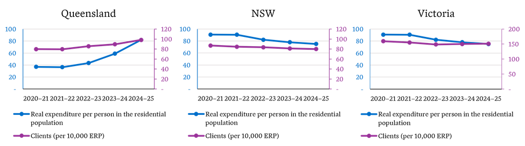
    Crucially, SHS client numbers and services are also shaped by supply. Funding, workforce capacity, eligibility rules, referral practices and geographic coverage affect how many people a service can assist and therefore how many appear in the data. If funding expands, recorded client numbers may rise because more need can be recognised and met. If capacity is constrained, apparently stable client numbers may coexist with increasing homelessness and unmet demand. As an example of how funding influences consider the different picture given by homelessness clients per capita in Queensland, NSW and Victoria alongside expenditure as per the Report on Government Services 2026.

    Source: AIHW Supplementary tables – Historical tables SHSC 2011–12 to 2024–25 and Report on Government Services 2026 – housing and homelessness

    This creates an important interpretation issue. A service-use trend is partly a measure of government and community-sector response, not simply a measure of underlying homelessness. SHS data is therefore indispensable for understanding demand, pathways, support and outcomes, but it should not be used alone to estimate the prevalence of homelessness.

    New Zealand’s move away from Census data

    New Zealand’s Census modernisation makes this distinction especially relevant. Stats NZ is moving away from traditional Censuses and towards an administrative-data-first census, supported by surveys. The approach is intended to rely more on information already collected by government and other organisations, while surveys remain important for validation and for information missing from those records.

    Homelessness is a demanding test case. The 2023 estimate of rates of severe housing deprivation in New Zealand combined Census variables and improved collection strategies to estimate people living without shelter, in temporary accommodation, sharing accommodation or in uninhabitable housing. Stats NZ described these as the best point-in-time estimates available, while acknowledging likely undercounting and a substantial group whose status could not be determined.

    An administrative data first model may improve timeliness, but it also risks making people visible only through their contact with government systems. The New Zealand approach therefore reinforces the need for surveys, tailored enumeration and transparent assessment of coverage gaps.

    No single measure is enough

    The Census provides the best national estimate of how many people are experiencing homelessness at a point in time, while SHS data provides more timely insights into service demand, client needs and pathways through homelessness. Neither source on its own can provide a complete picture.

    An evidence-informed approach to policy needs insights from multiple sources. National datasets can be complemented by longitudinal studies and linked administrative data studies. For example:

    • Journeys Home provide insights into people’s experiences and pathways into and out of homelessness
    • Evaluations of the Aspire Social Impact Bond in South Australia and Housing First programs in New Zealand help us understand longer-term outcomes
    • Our work examining cross-sectoral pathways prior to homelessness in NSW can help identify earlier intervention points across service systems.

    We can also consider proxy indicators, for example social and affordable housing rates, social housing waitlists, rental market indicators as is done by Homelessness NSW. And we need to supplement quantitative analysis with the input of people working in, and affected by, the homelessness support system.

    Ultimately, measuring homelessness is not simply a statistical challenge. Better data leads to better policy, better targeting of services and a stronger understanding of what works. As homelessness pressures evolve, Australia will need to continue investing not only in data collection, but also in monitoring, evaluation and data linkage so long-term impacts of programs and policies can be understood and improved over time.

  • APRA’s latest NCPD data points to an uneven liability market

    APRA’s latest NCPD data points to an uneven liability market

    APRA’s latest National Claims and Policies Database (NCPD) release provides an early view of how professional indemnity and public liability premiums are shifting across the Australian market. Our initial analysis points to five key movements insurers, brokers and insureds should be watching.

    The National Claims and Policies Database (NCPD) provides one of the most comprehensive views of professional indemnity and public liability insurance experience in Australia, drawing on policy and claims data from APRA-regulated general insurers.

    APRA’s latest NCPD release highlights diverging premium movements across Australia’s liability insurance market.

    In this article, we focus on premium movements across the latest policy data. Because gross written premium for an underwriting year continues to develop over subsequent reporting periods, we have projected ultimate premiums for recent underwriting years based on the average development observed in the historical data. As a result, the figures shown may differ from the raw numbers extracted from the database.

    With that context in mind, five movements stand out from our initial review.

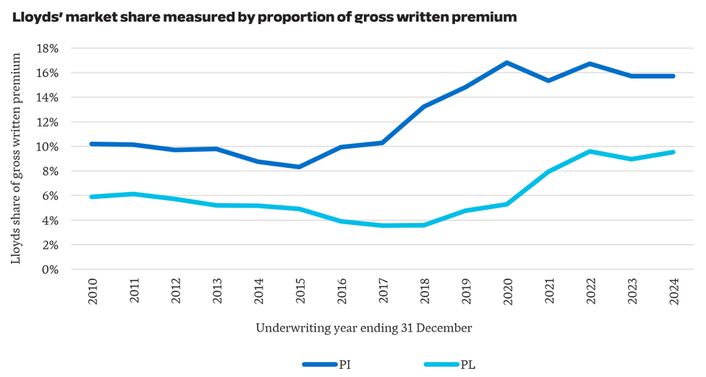
    1. Lloyds market share has been stable over the last three years at 10% for PL and 16% for PI. This followed a period of growth, where they doubled their share of the PL market from 5% in 2020 to 10% in 2024. For PI, they grew from 10% in 2017 to 16% in 2024.

    These numbers are consistent with Lloyds increasing their capacity in Australia. While Lloyds’ market share has remained relatively stable from 2022 to 2024, the greater competition in the Australian market has placed pressure on rates.

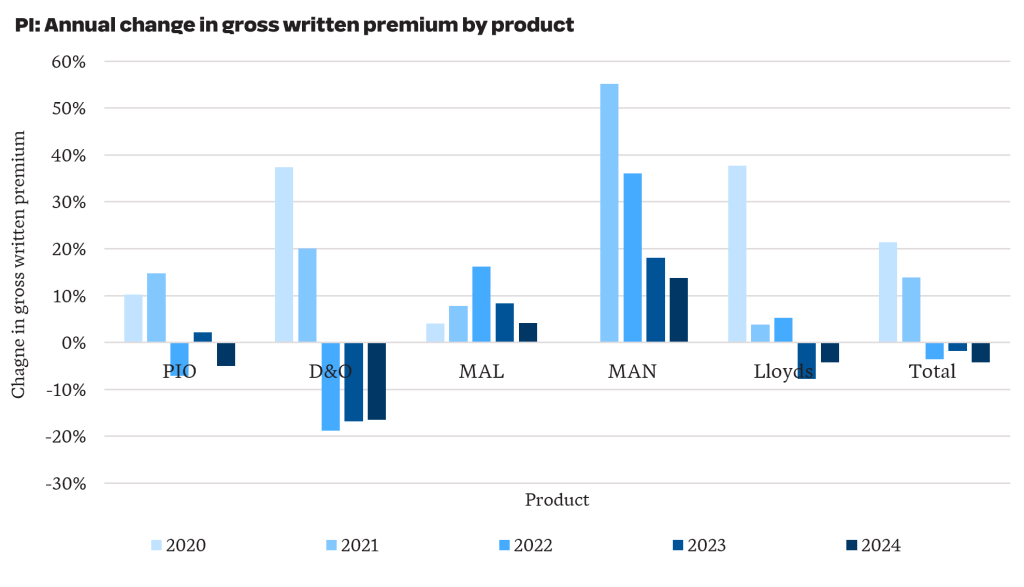
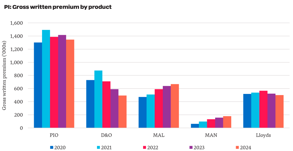
    2. The PI market is soft in aggregate, recording a 4% reduction in GWP from 2023 to 2024. However, the story varies by product, with a 16% reduction for D&O and a 14% increase over the year for management liability.

    Total PI GWP including APRA-regulated and Lloyds reduced from $3.30 billion in 2023 to $3.19 billion in 2024 (-4%). More recent industry data shows this downward rate pressure has continued into 2025 and 2026.

    For business written by APRA-regulated insurers, D&O written premiums reduced by over 40% from $874 million to $493 million since 2021. PIO accounts for 50% of the PI premium written by APRA-regulated insurers and has reduced by 10% from $1.49 billion in 2021 to $1.35 billion in 2024.

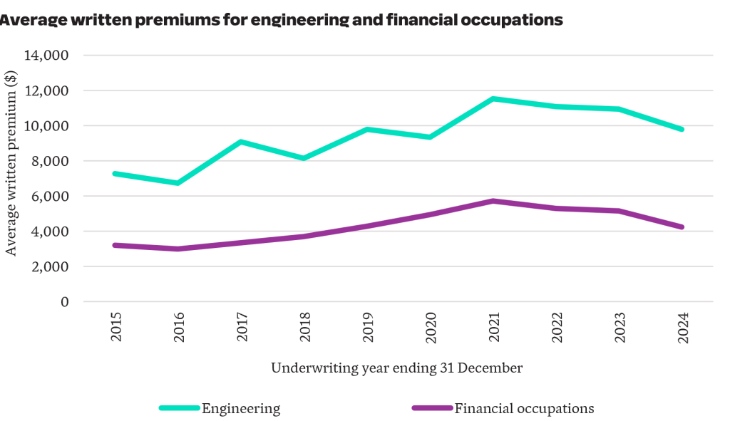
    3. Engineering and financial occupation PI premiums have moderated from COVID-era highs.

    Engineering and financial occupations account for 48% of PIO written premiums. Both professions experienced notable premium increases during the COVID-era, in part reflecting heightened concerns around building defects and combustible cladding for engineers, and the impacts of the 2019 Financial Services Royal Commission for financial occupations.

    The latest data suggests conditions have since eased. The engineering profession experienced a 15% reduction in average written premiums, while financial occupations saw a 26% reduction.

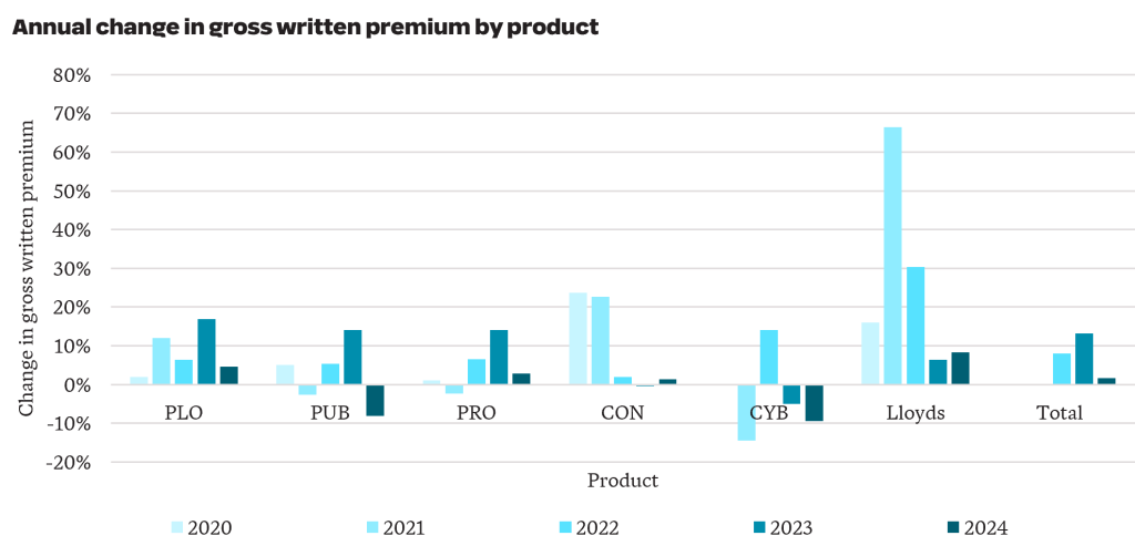
    4. GWP increased by 2% from $3.7 billion in 2023 to $3.8 billion in 2024 for public liability. Results by product were mixed, with Public Liability Other (PLO) increasing by 5% and Cyber reducing by 9%

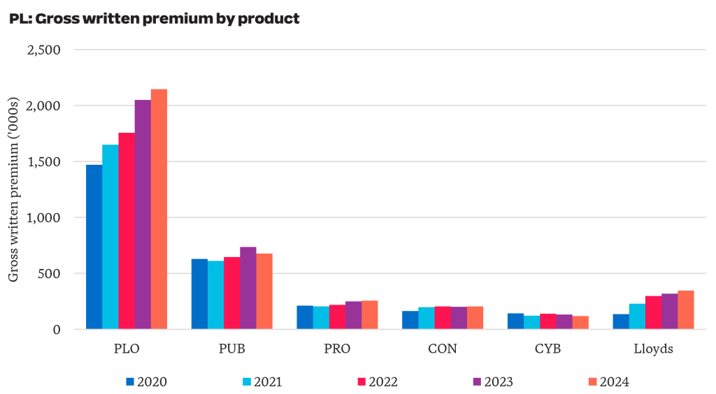
    For business written by APRA-regulated insurers, PLO GWP increased by 46% from $1.5 billion in 2020 to $2.1 billion in 2024 (see chart below). This is on top of a 32% increase in GWP seen over the five years prior. Taken together, GWP nearly doubled between 2015 and 2024. Average premiums have increased materially, driven by increased pressure from worker-to-worker claims, higher legal and litigation expenses and an increase in psychological injuries.

    More recent industry data suggests premiums have started to stabilise in some sectors of the PL market.

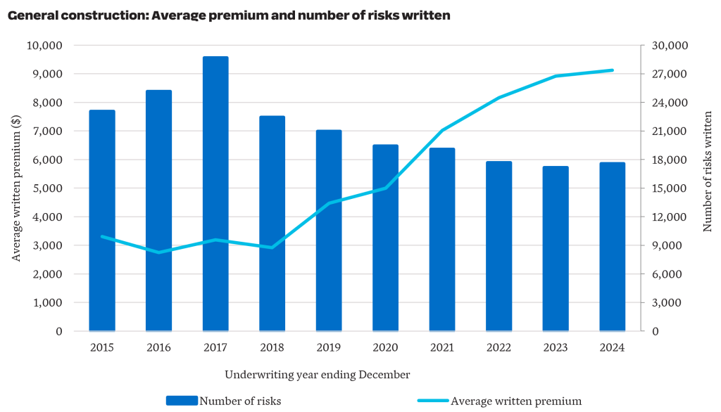
    5. Affordability pressures are evident in the construction sector, with average PL premiums tripling in six years.

    The recent Parliamentary Inquiry into insurance premiums for small businesses has placed affordability under the spotlight. The construction industry was one of the sectors called out for facing increasing insurance costs.

    For General Construction business underwritten by APRA-regulated insurers, average written premium tripled from around $3,000 to over $9,000 in the six years from 2018 to 2024. Over the same period, the number of risks written has reduced by 22% from 22,500 to 17,500.

    APRA’s latest NCPD data points to a liability market that is not moving in one direction. Our initial review highlights areas where premiums appear to be easing, particularly across parts of professional indemnity, alongside sectors where affordability pressures remain acute. As the claims data is examined in more detail, the next question is whether these movements reflect short-term market adjustment or a more sustained shift in risk appetite, capacity and claims expectations.


    Want more analysis on NCPD data?

    We’ll shortly share more insights on APRA’s latest NCPD release as we analyse the latest claims experience.

  • Behind the headline – What May’s CPI data means for insurers and Australia’s insurance market

    Behind the headline – What May’s CPI data means for insurers and Australia’s insurance market

    Australia’s latest CPI data points to a more complex inflation environment for general insurers. Headline inflation has eased slightly, but underlying inflation remains above the Reserve Bank’s target band, while cost pressures in areas directly relevant to home and motor claims continue to build. We explore what the May CPI release means for insurers, with three areas to watch across claims costs, pricing assumptions and household affordability.

    Headline inflation over the 12 months to May 2026 was 4%, down from 4.2% over the 12 months to April 2026. However, trimmed mean inflation* – the Reserve Bank’s preferred measure of underlying inflation – increased by 0.2% over the month to 3.6%, persisting above the 2-3% target band.

    There are a variety of both compounding and offsetting effects flowing through the economy. Fuel/energy costs have increased due to the Iran war, inducing flow-on impacts to other sectors of the economy through increased freight and agricultural costs. Recent policy effects including the fuel excise subsidy and other cost-of-living measures by State and Federal governments have also been influential market forces.

    Fuel prices are a key link between global shocks and local cost pressures.

    What insights can insurers take from the May CPI release? Here are our top three highlights.

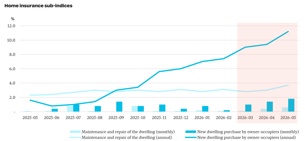
    1. New dwelling costs increased by 11% over the year to May, up from 2% over the year prior. Maintenance and repair cost increases have been more subdued, increasing by 4% over the year to May, up from 2% over the year prior.

    Inflation for maintenance and repair costs of dwellings and new dwelling purchases

    The new dwelling purchase series (blue series) includes changes in building materials costs and labour costs. This index has increased steadily from November 2025, outpacing the increase in maintenance and repair costs (light blue series). The double digit increase in new dwelling costs aligns with increased competition for skilled tradespeople and construction materials, with greater demand continuing to push prices higher.

    There are early signs effects from the conflict in the Middle East is flowing through to higher new dwelling costs, as seen in the shaded orange region in the chart. Inflation over the months of April 2026 and May 2026 was 1.4% and 1.8%, respectively. This compares with 1.2% and 0% over the same months last year. Month-to-month inflation figures are volatile and are to be treated with caution.

    As maintenance and repair costs and the cost of new dwellings are subject to different inflationary pressures, insurers will need to closely monitor the mix between partial and total losses.

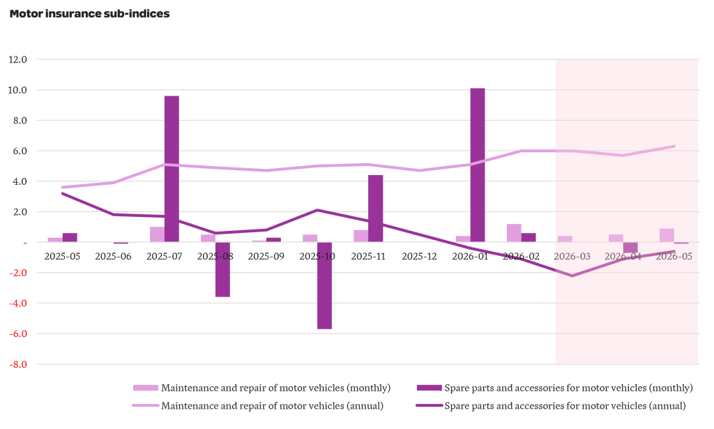
    2. The cost of maintaining and repairing motor vehicles has increased by 6% over the last year, up from 4% the year earlier.

    Inflation for maintenance and repair costs of vehicles and spare parts and accessories for vehicles.

    The cost of maintaining and repairing a motor vehicle (light purple series) has grown faster than the broader CPI and has increased through FY26. This series captures the cost of labour, parts and materials, with the increase over the year attributable to both rising labour costs and vehicle complexity. Over the same period, the cost of spare parts and accessories (dark purple series) has declined by 0.6%.

    Motor insurers should be cognisant of growing labour and repair complexity costs which have outstripped general inflation. We expect this trend to persist as electric vehicle penetration continues to accelerate (see our recent article on EVs for more details), requiring more specialised skillsets and parts.

    3. Consumers are continuing to feel the squeeze. Since the start of 2024, prices as measured by the CPI have increased by 11% to the end of March 2026. Meanwhile, wages, as measured by Average Weekly Earnings, have only increased by 8% meaning that real wages have declined by 3% over the period.

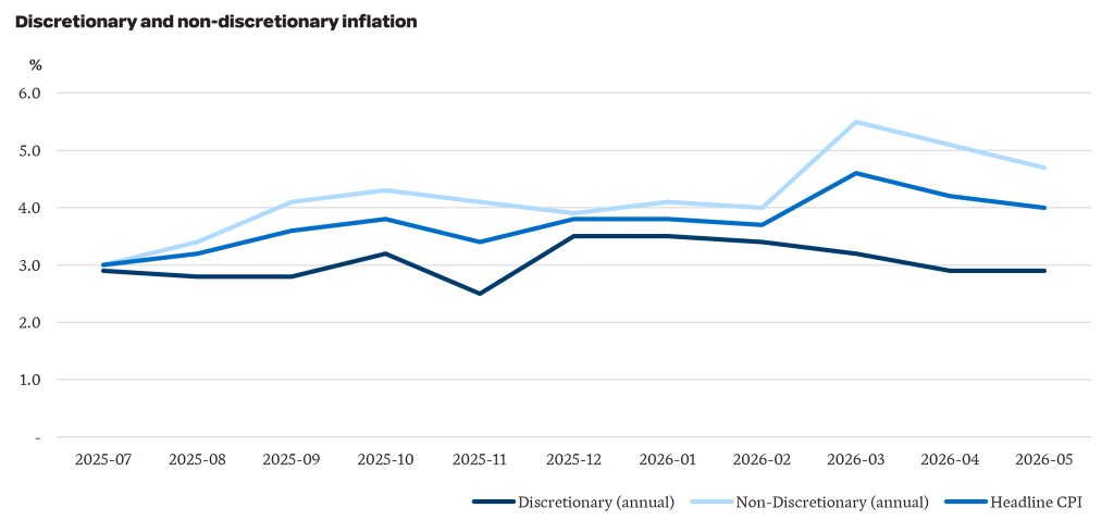
    This is only part of the picture. May CPI data shows the cost of non-discretionary items has increased faster than discretionary items. Non-discretionary items are goods and services which are purchased to meet a basic need – for example, food, shelter and healthcare. Discretionary items are those which are considered “optional”, such as takeaway meals, alcohol and holidays. The chart below highlights non-discretionary inflation has been persistently higher than discretionary inflation over FY26 and consequently, is also higher than headline CPI inflation.

    Increases in the cost of non-discretionary items have a larger impact on lower-income households as these essentials cannot be easily deferred or substituted as household budgets tighten. Following the Middle East conflict, non-discretionary inflation has spiked up to the 5%, driven by increases in automotive fuel prices. As a result, low income households are facing more pressure than implied by the headline inflation numbers.

    Cost of living has been of substantial focus in recent years, particularly politically where the government has introduced measures to offset part of the impact of rising prices. For example, the Fair Work Commission’s decision to increase the National Minimum Wage by 6% is expected to go part way to addressing some of these pressures for the lowest paid workers.

    What do the latest numbers mean for the insurance industry?

    1. The pressure on affordability is intensifying. Broader cost of living pressures, combined with higher-than-average levels of inflation in home and motor repair costs which will increase premiums, will squeeze already-tight household budgets.
    2. As the status of the conflict in the Middle East changes regularly, so too do inflation expectations. We are only now starting to see the impacts of higher fuel prices flow through to the cost of materials. Even if the conflict ends tomorrow, expectations are that it will take over six months for things to return to normal. This will have implications for pricing and reserving.
    3. Financial vulnerability is expected to increase and will impact renewal rates, selected excesses and sums insured.

    The May CPI release reinforces that insurers are operating in an environment where inflationary pressure is uneven, volatile and closely tied to household affordability. For insurers, the challenge is not only to respond to current inflation, but to track how these pressures flow through portfolios over time and adjust pricing, reserving and risk settings as new trends emerge. Additionally, insurers will need to closely monitor the impact of affordability pressures on their portfolios so their products align with customer needs to maintain relevance, trust and resilience.

    *The trimmed mean removes the most extreme price movements.  

  • Catastrophic injury care – the hidden cost of e-bike adoption

    Catastrophic injury care – the hidden cost of e-bike adoption

    As fuel prices rise, more households are turning to e-bikes to manage transport costs. This shift brings a less visible consequence – a higher risk of serious injury and the long-term cost of care for injury schemes. Australian data on e-bike injuries remains fragmented, which makes it difficult for scheme regulators to judge the scale of emerging exposure. We estimate how recent growth in e-bike adoption could affect the incidence and cost of catastrophic injury care in Australia.

    Although e‑bike adoption in Australia has lagged Europe and parts of Asia, e‑bikes are increasingly viewed as a cost‑effective alternative to car ownership and a more environmentally sustainable mode of transport. Improvements in battery technology, expanding retail availability, and rebate programs in several jurisdictions have further supported uptake.

    As e-bike use grows, so does exposure to long-term injury care costs.

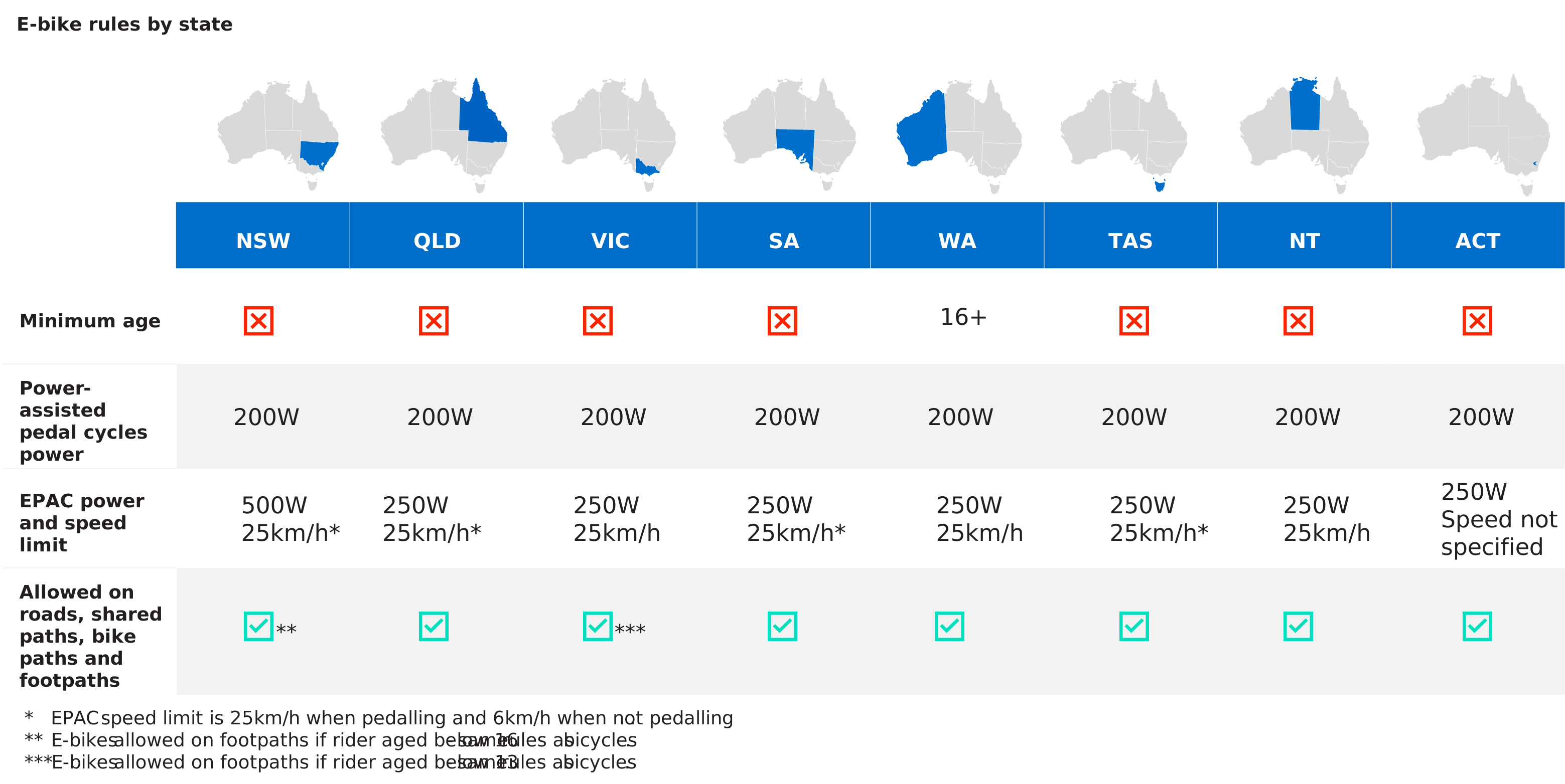
    In Australia, the use of e-bikes is restricted. Most jurisdictions only permit use of power‑assisted pedal cycles (generally limited to 200 W) and electrically power‑assisted cycles (EPACs, generally limited to 250 W). Helmet use is mandatory throughout Australia, but minimum age restrictions are limited.

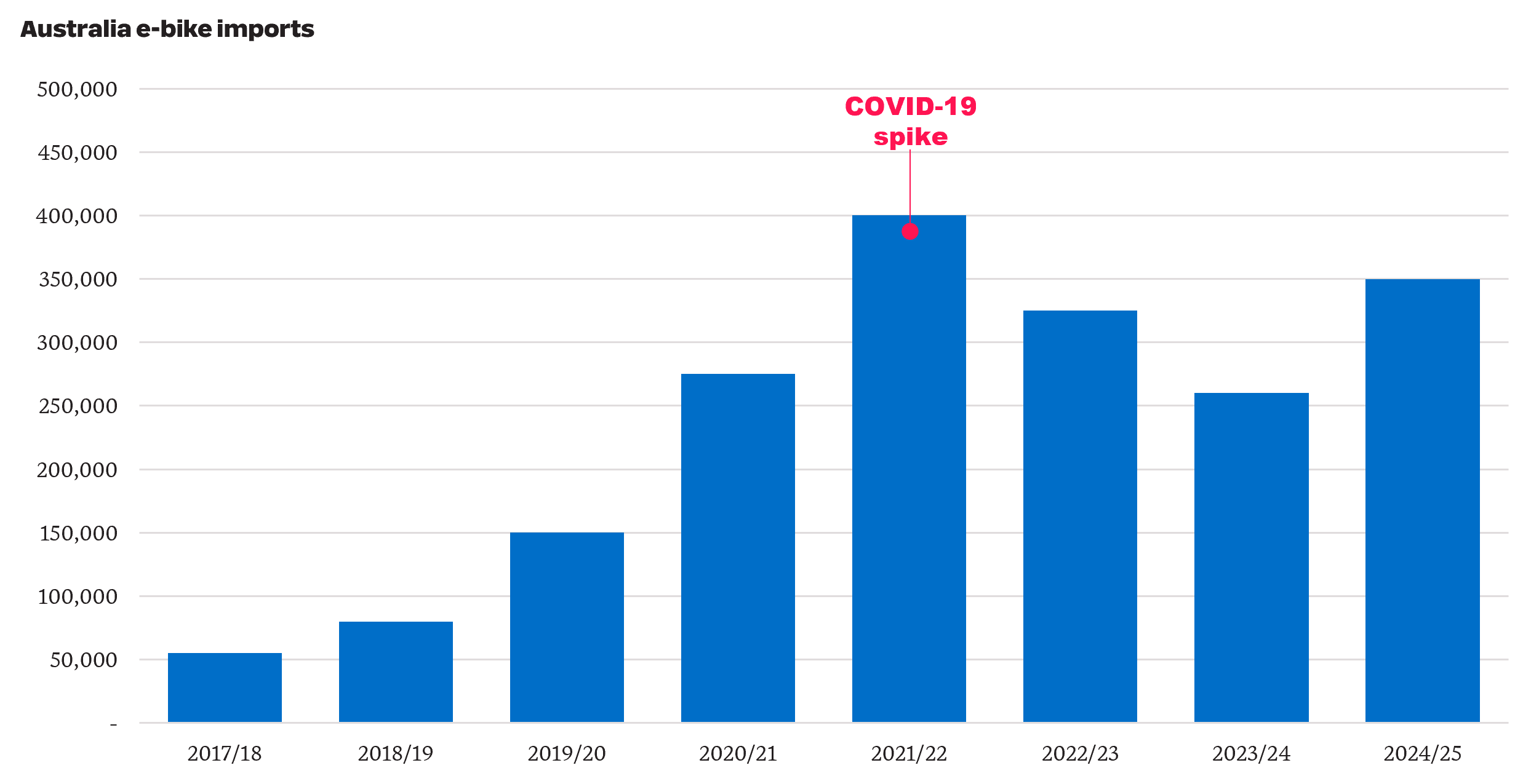
    Official national sales data is not available, as e‑bikes do not require registration or licensing in Australia. However, industry reports indicate annual sales increased from approximately 9,000 units in 2017 to around 254,000 units in 2025. Import data showed a similar pattern, with e‑bike imports rising from approximately 55,000 units in 2017/18 to around 350,000 units in 2024/25. The number of e-bikes imported spiked to 400,000 in 2021/22, coinciding with the COVID‑19 pandemic, when commuters sought transport modes which enabled greater social distancing.

     Historical e-bikes imported into Australia grew rapidly and remain at high levels.

    As e‑bike adoption has increased, reported injuries associated with their use have also risen. Contributing factors cited in media reports include higher operating speeds (including illegal modifications), alcohol use and low rates of helmet use.

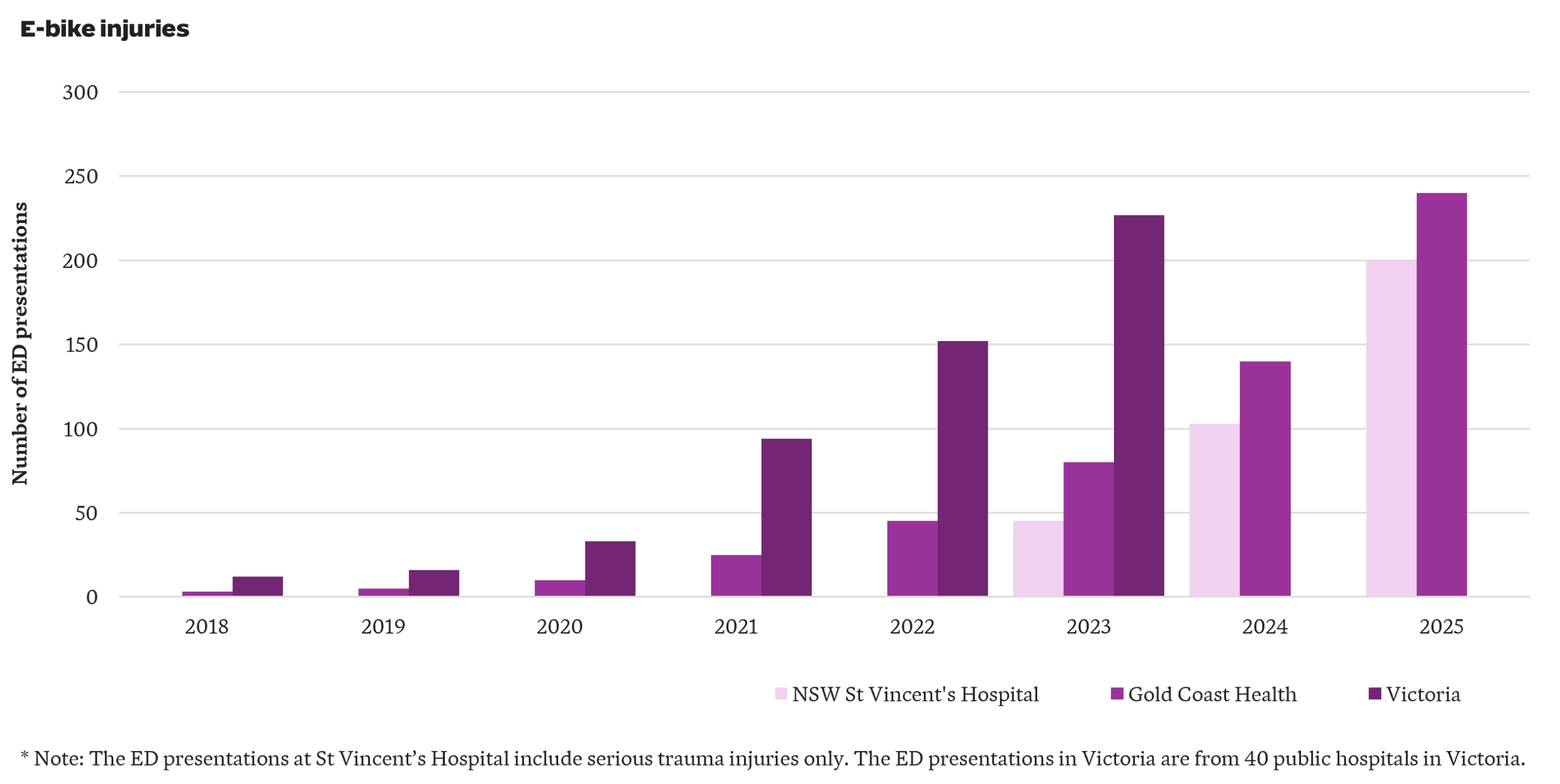
    Australian data on e‑bike injuries is fragmented and incomplete, with e‑bike injuries often grouped with those from other micromobility devices e.g. e-scooters. Despite these limitations, available data consistently indicate strong growth in injuries over time – shown  by growth in emergency department (ED) presentations observed at St Vincent’s Hospital (NSW), Gold Coast Health (QLD) and Victoria.

    The number of e-bike injuries in Australia has increased significantly over recent years.

    Although rising e-bike injuries impose costs on society, who ultimately bears those costs depends on how the injury occurs. In general:

    • For single-vehicle accidents, such as falls from e-bikes, the injured rider may be able to claim through private insurance, including personal accident, income protection or private health cover. If the accident occurs on private property, the rider may also be able to claim under the property owner’s home insurance.
    • If a pedestrian is injured by an e-bike, they may be able to seek compensation from the rider or the rider’s public liability insurance policy where the rider was at fault. Otherwise, they may need to rely on private insurance, similar to the case of a single-vehicle accident.
    • If an e-bike rider is injured in the course of work, they may be able to claim workers compensation.
    • If an injury arises from the use of a permitted shared e-bike, compensation may be available under the provider’s insurance policy. Once the provider’s policy limits have been exhausted, in some jurisdictions and in some instances costs may be met through the motor accident injury scheme (e.g. the Motor Accidents Compensation Scheme in the Northern Territory).
    • If an e-bike is involved in a crash with a motor vehicle, the injured user may be able to claim against the motor vehicle driver’s compulsory third party (CTP) insurer. If the injuries are catastrophic, the injured user may qualify for entry into a motor accidents lifetime care scheme.

    Insurers and injury schemes bear only part of the overall cost of e-bike injuries. Where compensation is available through CTP or workers compensation, entitlements vary significantly by jurisdiction. All Australian jurisdictions provide support for the treatment, rehabilitation and care costs of people who are catastrophically injured in accidents involving a motor vehicle – and the cost of providing this support is likely to be broadly similar across jurisdictions. These are the most expensive injuries, and so we focus on projecting the indicative cost of these over the next decade.

    Projection assumptions

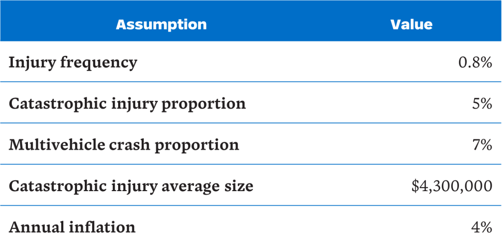
    We make the following assumptions to project the cost of e-bike catastrophic injuries in Australia, discussing each in turn:

    Injury frequency

    We define injury frequency as Emergency Department (ED) presentations relative to the number of e-bikes owned privately. We have excluded shared e-bikes from the exposure measure as their numbers are relatively small (approximately 25,000 compared to 1 million privately-owned e-bikes). Based on available state level data, estimated injury frequencies ranged from around 0.4% to 1.3% per bike per year, broadly consistent with international experience in high uptake countries such as the Netherlands (0.6% to 0.7%). We have adopted an injury frequency of 0.8%.

    Catastrophic injury proportion

    Of greatest cost is the subset of injuries which are catastrophic, i.e. traumatic brain injuries (TBIs) and spinal cord injuries (SCIs). Australian and international evidence on injury severity is mixed:

    • A study from Victoria found intracranial injuries accounted for around 4% of e-bike injuries whilst a Queensland study found TBIs represented around 8% of ED presentations from e-mobility devices (primarily e-scooters).
    • Studies from the Netherlands reported substantially higher proportions of TBIs among e-bike injuries, ranging from 15% to 29%. Another study of younger patients found TBIs in 38% of e‑bike injuries.
    • Studies from the United States suggested TBI represented 29% to 54% of e-bike injuries and spinal fractures represented 11%.

    The higher TBI proportions in the international studies likely reflect non-mandatory helmet wearing and higher permitted speed and e‑bike power. Relying on the Victorian study, we assume 5% of e-bike injuries are catastrophic (comprising approximately 4% TBIs and 1% SCIs) to project the number of catastrophic injuries.

    Multi-vehicle crash proportion

    We estimate the proportion of injuries involving collisions with motor vehicles to project the number of catastrophic injuries eligible to enter (motor accidents) lifetime care schemes. One Australian study suggested around 6% of e-bike injuries involved collision with a car, compared to materially higher proportions overseas, which may be explained by differences in traffic conditions. Relying on the Australian study and allowing an additional 1% for crashes with non-car vehicles, an indicative assumption of 7% was adopted.

    Catastrophic injury average size

    The lifetime cost of providing treatment and care support for a catastrophically injured person is significant and can vary widely depending on injury type, severity, age and the availability of informal care. SCIs are generally more costly than TBIs, and injuries to younger claimants result in higher lifetime costs. Based on our experience across Australian lifetime care schemes, we have assumed an average cost of around $4.3million (in June 2025 dollars).

    Annual inflation rate

    We have made an allowance for treatment and care costs to increase at 4% per annum, recognising both normal cost inflation and the tendency for attendant care costs and medical expenses to increase at a higher rate (i.e. superimposed inflation).

    Projection scenarios

    To estimate the future cost of catastrophic e-bike injuries, we apply the above assumptions to three indicative scenarios of private e-bike usage (a base scenario and two alternative scenarios of increased usage). The scenarios are illustrative rather than exhaustive – actual outcomes may fall outside the range of these indicative estimates.

    The base scenario assumes e-bike sales grow at 9.4% per annum, increasing from approximately 289,000 units in 2026 to more than 650,000 units by 2035 (based on forecasts from a market research company). We assume replacement (as e‑bikes reach the end of their usable life) every four years on average.

    To illustrate the potential impact of increased e-bike usage, we constructed two alternative scenarios for comparison to the base scenario:

    • Scenario A (temporary sales increase): Sales in March to June 2026 are assumed to be double what they were in the same period in 2025. From 2026/27 onwards, annual increases in unit sales are equal to the base scenario.
    • Scenario B (persistent sales uplift): Sales in March to June 2026 are assumed to be 150% higher than the same period in 2025. From 2026/27 onwards, sales grow 1% higher than the base scenario i.e. at 10.4% per annum.

    These indicative scenarios attempt to reflect a more recent surge in the purchase of e-bikes. Australia’s largest bicycle retailer reported a 136% increase in sales in late March 2026 compared to the same period in the previous year. This increased take-up is likely in part due to increased fuel prices (up by approximately 40% to 70% in March and April 2026) and temporary fuel shortages reported in some regions, following the outbreak of the Iranian conflict.

    Our illustrative projections show:

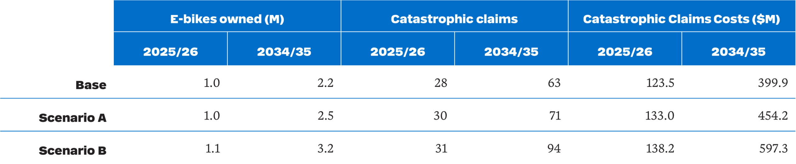
    • Ownership projected to increase from approximately one million units in 2025/26 to 2.2 million, 2.5 million and 3.2 million units by 2034/35 under the base scenario and Scenarios A and B respectively.
    • The number of eligible catastrophic e-bike injury scheme participants projected to more than double from 28 in 2025/26 to 63 in 2034/35 under the base scenario.  By 2034/35, participants under Scenarios A and B are projected to be 71 and 94, or 13% and 49% above the base scenario.
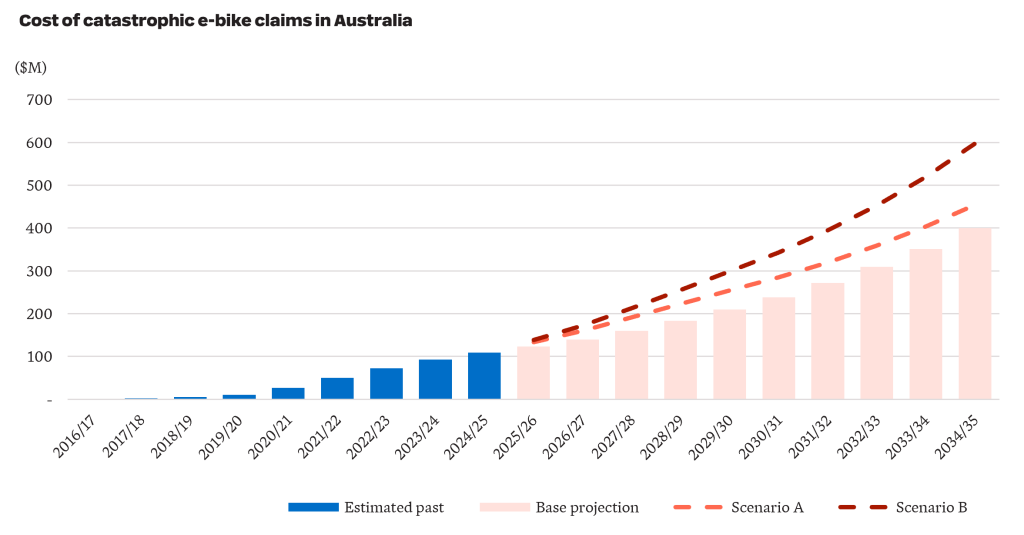
    • Catastrophic e-bike injury costs incurred projected to more than triple from $124 million 2025/26 to $400 million in 2034/35 under the base scenario. Under Scenarios A and B, costs are projected to increase further (to $454 million and $597 million, respectively).
    • The projected increase in e-bike use may be partially offset by substitution effects (i.e. a reduction in the number and cost of injuries associated with other road users, such as cyclists and motorcyclists).
    Catastrophic e-bike injury claims costs in Australia are projected to escalate over the next decade.

    There is recent evidence of further upward risk on costs. Data from the Sydney Children’s Hospital Network shows children presenting with e‑bike injuries increasing sharply from 33 cases in 2023 to 94 cases in 2025. Kidsafe Victoria reported a 61% increase in emergency department presentations among children aged 2 to 18 from 2023/24 to 2024/25. Catastrophic claims involving children tend to be materially more expensive, but we have not reflected this in our illustrative projections.

    Regulation and policy are evolving

    Regulatory settings are evolving rapidly and will influence future injury patterns. In recent years, growing concern has emerged about the safety impacts of increasing e-bike use, prompting regulators to introduce several regulatory changes. For example:

    • In December 2025, the Commonwealth government reinstated the adoption of EN 15194 as the absolute national reference standard for e-bike imports.
    • In NSW, proposed reforms include the introduction of a minimum rider age, a reduction in permitted e-bike power from 500W to 250W, and new enforcement powers allowing police to seize and destroy illegal e‑bikes.
    • In Queensland, reforms include the application of a minimum rider age, restriction in speed on footpaths, requiring e‑bike riders to hold a valid driver’s licence, and giving police power to seize and dispose of non-compliant e-bikes. Devices with higher power/speed will be reclassified as mopeds or motorcycles, triggering registration and insurance requirements.

    This evolving policy environment represents an additional source of uncertainty around future cost experience.

    Overall, while e-bikes deliver benefits, catastrophic injury exposure is no longer a marginal issue. The fuel price shock associated with the Iran conflict may accelerate adoption further, bringing risks forward. Australia currently lacks a uniform national framework for e-bike regulation and data collection, which makes analysis difficult. Improved data collection, ongoing monitoring and coordinated policy responses will be essential to manage these emerging costs before they become entrenched – and substantially more expensive.

  • Australia’s EV boom – How insurers need to respond

    The current fuel crisis has materially accelerated Battery Electric Vehicle (EV) adoption in Australia. In March 2026, 16,000 new EVs were delivered, up from around 8,000 a year earlier. EV sales will continue to increase over the coming months. We explore what this means for motor insurers and provide some practical considerations.

    In March 2026, 16,000 new EVs were delivered

    The EV surge

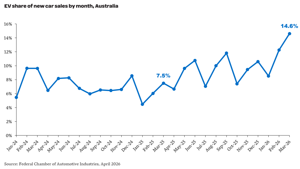
    EV sales as a proportion of all new car sales in Australia reached a new peak of 14.6% in March 2026, up from 7.5% in March 2025.

    New EV car sales reached a peak of 14.6% in March 2026

    The acceleration in EV uptake is unsurprising. Analysis reported in The Australian showed the average cost per kilometre driven is over six times lower for EVs relative to Internal Combustion Engine (ICE) vehicles. For an EV, the cost was around $0.02. For an ICE vehicle, it was closer to $0.14 (excluding utes and large SUVs). The difference highlights the magnitude of the fuel/electricity cost difference.  Of course, this doesn’t provide a complete picture of ownership cost differences. EVs are still on average more expensive than ICEs, but the gap is reducing and is expected to continue decreasing over time.

    Implications for motor portfolios

    While the EV share of motor portfolios is currently small (for example, EVs currently represent around 2% of IAG’s motor portfolio), a structural shift in the fleet composition, will have meaningful consequences for motor insurers.

    A higher claim severity

    EVs attract higher average repair costs than comparable ICE vehicles, due to a combination of:

    • Repairs requiring specialist knowledge which attract higher labour rates and are often restricted to a limited network of authorised centres.
    • Significant total loss exposure – EV battery packs continue to account for a high proportion of vehicle value (currently estimates in the 30%-50% range). Even minor collisions can trigger high repair costs where battery damage is found.
    • EVs are typically equipped with Advanced Driver Assistance Systems (ADAS) and sensor suites, with high replacement and calibration costs.

    A lower accident frequency, perhaps?

    EVs sold tend to include more advanced safety technology than the average ICE vehicle on the road today and should in theory demonstrate a lower claim frequency. However, reports to date have been mixed. An analysis by Parmar and Woods (2025) of data from Norway reported a 17% lower accident frequency overall for EVs compared to ICE vehicles. This study focused on passenger vehicles and found EV frequency to be lower across most dimensions (e.g. type of accident, road type, speed limits, weather), but higher frequency in certain scenarios (e.g. pedestrian accidents and rear-end collisions).

    How should insurers respond?

    EV claims inflation is outpacing ICE vehicles due to battery costs and limited repair networks. As EV volumes grow, engaging with repairers early to ensure access to a sufficient network of certified repairers will be an important lever to managing claims cost.

    How do EV and ICE premiums compare?

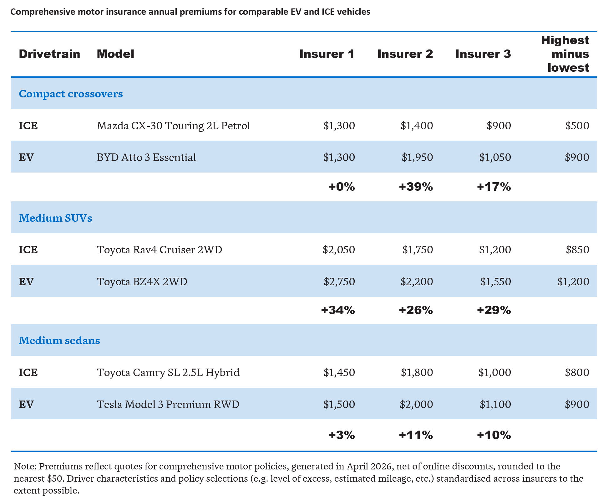
    EVs typically cost more to insure than comparable ICE vehicles. Part of the reason is EVs tend to be more expensive than comparable ICE vehicles. However, this is only part of the story.

    We’ve analysed quotes from three insurers for three common ICE vehicles and three EVs with similar vehicle values. Our market scan showed each insurer offered a higher price for the EV relative to the comparable ICE variant – with the difference ranging from +0% to +39%.  We also found a higher variation in premiums for EVs. For example, for the BYD Atto 3, we found a $900 difference between the cheapest and the most expensive premium. For the petrol Mazda CX-30, the difference was $500.

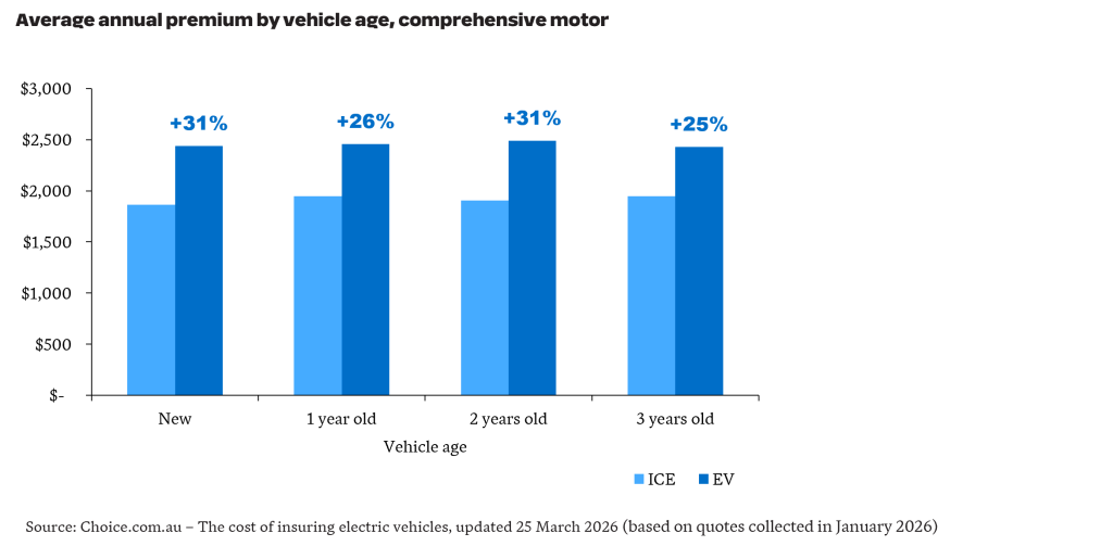
    These results align with analysis by choice.com.au which compared the average annual comprehensive motor premium across 16,000 EVs and 36,000 ICE vehicles – showing EVs were up to 31% more expensive.

    Insurance for EVs were up to 31% more expensive

    What insurers need to monitor to stay ahead

    The fuel crisis may have done more than shift consumer behaviour in the short term – it may have pulled forward Australia’s EV transition by several years.

    For motor insurers, the portfolio implications will compound over time and the developments warrant active monitoring. The major changes will be:

    1. Fleet composition drift – As EV penetration rises, the mix of vehicles on risk will continue to shift towards EVs. Insurers will need to consider the impact of changes in brand mix with several new manufacturers with little local claims history entering the market. Over the short to medium term, with the accumulation of local EV claims experience, insurers should be better placed to validate and revise assumptions currently embedded in their pricing – replacing assumptions informed by experience overseas or using non-EV proxies.
    2. Repairer costs and network expansion – The current higher EV repair costs is in part a product of repairer scarcity and parts supply immaturity. As the repair ecosystem develops, average EV claims costs should moderate – however the pace of this development is highly uncertain. Pricing models should be updated as experience emerges to maintain competitiveness and at the same time ensure pricing remains adequate.
    3. Government initiatives – EV uptake is materially impacted by government initiatives – in Germany, the US and China, material reductions in EV sales were observed following roll-back or removal of subsidies. For Australia, there is uncertainty around potential scaling back of the Fringe Benefits Tax exemption for EVs, at least until the May 2026 Budget. State government initiatives, such as the 2026 update to the NSW Electric Vehicle Strategy which includes extension of electrification incentives to commercial vehicles, training initiatives for EV mechanics and commitment of $100M to expand charging infrastructure, should accelerate EV adoption.

    The fuel crisis may do more than temporarily alter driving behaviour. It could accelerate a lasting shift in Australia’s vehicle mix, bringing forward the transition to electric vehicles and reshaping motor portfolios sooner than many insurers expected. As EV exposure grows, insurers that respond early will be better placed to protect margins and retain market share.

  • Key trends in quantitative evaluation for Government

    Clear evidence about outcomes underpins sound policy and funding decisions, yet generating that evidence is rarely straightforward. Choices about data and evaluation design shape what conclusions are possible, particularly when trying to understand impact and why programs do (or don’t) work for different groups. Drawing on a decade of experience, Hugh Miller reflects on how quantitative evaluation has matured to better allow government to understand impact.

    Recently, I had the opportunity to present some thoughts on how evaluation has changed over the past decade, with an emphasis on the quantitative analysis we specialise in. My main thoughts are summarised below, and have implications for most areas of government.

    I also recognise many of the items below partly reflect my growth as an evaluator as much as broader changes in the space.

    Enduring data linkages are changing how governments evaluate impact.

    Data linkage has been a key part of the evaluation landscape for the past decade or so, since it enables us to look beyond what is in the specific program data. For instance, we can track across time (e.g. do people using a mental health program re-access services afterwards?), across services (how frequently do they present to hospitals with mental health issues?), and can be used to make broader comparisons (how do service patterns compare to similar people who did not access the program?).

    Many of our past evaluations have involved bespoke linkages, where a specific set of administrative and program data would be linked together for a specific cohort. This added significant time and effort to the analysis. In some cases, this was also duplicative and wasteful – we would see the same people and datasets linked multiple times for different projects.

    A much better solution is to have regular enduring linkages that can be accessed for specific projects. Governance and privacy provisions remain strong, but it avoids the delay associated with linkage and removes the duplication.

    Examples of these national and state-based assets include:

    Despite this progress, significant work remains. An obvious challenge in Australia remains the gap between State and Territory datasets and the Commonwealth – sharing and governing data for linkage remains complex, and inhibits work in areas of shared responsibility, which include health, education and disability.

    We’ve built a lot of models based on administrative data for government, and most carry the well-worn disclaimer that ‘correlation does not imply causation’. The reluctance to attempt to get at questions of causation often reflects a proper assessment of what is possible with the data, but is unsatisfying for policymakers who want to understand how a program or policy is affecting people.

    We have seen something of a causal revolution in the past two decades, with much theoretical and applied work occurring in statistics and econometrics to explore new methods and the circumstances where causation is reasonable (see for instance Pearl, 2009 or Imbens & Rubin, 2015*). These causal methods are increasingly popular, particularly in economics.

    I think this push is mostly positive – it is useful to have researchers think deeply on questions of cause, and what assumptions need to hold for results to be causal. It is also useful to have a variety of tools available to explore these questions when the right data presents. And it has encouraged researchers to be on the lookout for natural experiments that can create the insights we seek.

    There is always a question of whether the pendulum has swung too far, and in some cases this is definitely true. There are definitely pieces of work where the word ‘causal’ is now added because of an analytic technique where the underlying data warrants far more caution due to confounding factors or selection effects. But we are in a better place with our larger toolkit.

    One area I’ve particularly enjoyed is thinking carefully in the design stage of an evaluation to understand whether there are clever ways to exploit the data to ask more strategic questions.

    As an example, consider health interventions designed to help people regularly take their medication. A straight linkage between the program and an outcome such as hospital presentations would be unlikely to reveal much – we might actually see that people who take more medication go to hospital more (since their starting health may be worse). However, a more targeted approach that looks at outcomes for people hospitalised with a specific condition, then given a post-hospital medication regimen, allows for more controlled program and comparison group analysis, including whether there are subsequent re-admissions. In this case, we throw a lot of data away (by focusing on specific sub-cohorts and hospital presentations) but end up with a much more meaningful test.

    In a world with more linkage and larger datasets, the opportunity to be targeted and creative in the outcomes we measure is larger.

    Again, challenges remain, with some areas remaining difficult to convert into unambiguous meaningful outcomes. For example, mental health services remain difficult to evaluate, even with good linkage – a person no longer accessing MH services might indicate a good recovery, or an ongoing need that is no longer being met – and so it is hard to distinguish between the two.

    Evaluations often include an economic component, seeking to understand if the service offers good value for money, which in turn can inform program design and future funding.

    Historically economic analyses vary widely – particularly in the value placed on outcomes. For example, the value of successfully helping someone into employment will vary by factors such as the timeframe of employment assumed, whether government and/or private benefits are recognised, and how the opportunity cost of time while employed is recognised. This variation can be partly resolved by good transparency in reporting and greater use of standardised benefits to ensure consistency.

    A more fundamental source of variation is the degree to which assumptions (whether drawn from broader evidence or plausibly guessed) are used compared to numbers tied to quantitative outcomes. At worst, this creates unhelpful estimates that are not grounded in reality. My all-time least favourite economic analysis of a government program took estimated fiscal multipliers from international health programs and assumed that was a reasonable estimate of the benefit-to-cost ratio of the program, which means that you get large benefits irrespective of whether any actual value is delivered.

    Encouragingly, there is growing expectation that economic benefit estimates are meaningfully tied to outcome benefits. This can be challenging when funding cycles are short and when evidence is still emerging, but adding rigour and discipline will ultimately lead to better articulation of what a program is achieving.

    I’m ultimately optimistic about where evaluation is heading. Today, expectations are higher: evaluations are more likely to focus on measurable outcomes and explore impact. This shift means evaluation is better serving the need to inform funding and policy choices. This raises the bar for all of us – not just to produce analysis, but to be clear about what programs are achieving, for whom, and why.

    *Pearl, J. (2009). Causality. Cambridge university press and Imbens, G. W., & Rubin, D. B. (2015)Causal inference in statistics, social, and biomedical sciences. Cambridge university press.

  • Iran conflict fuelling compounding risks for Australian insurers

    The 2026 Iran conflict is reshaping the risk outlook for Australian general insurers. Pressures that are usually analysed separately are now converging, compounding an affordability crisis at least five years in the making with effects likely to outlive the conflict itself. As volatility becomes the new norm, understanding and adapting to this new risk landscape will determine who thrives.

    For many Australian households, insurance has now become one of the largest non‑discretionary expenses – home premiums are up almost 70%*, 15% of households are in affordability stress, the RBA has hiked rates twice in 2026 already, and heightened claims inflation will likely outlast the conflict.  For insurers, that pressure no longer sits only in claims costs. It is reshaping demand, investment risk, capital adequacy and portfolio composition at the same time.

    Separate pressures are converging, reshaping risk and compounding affordability challenges.

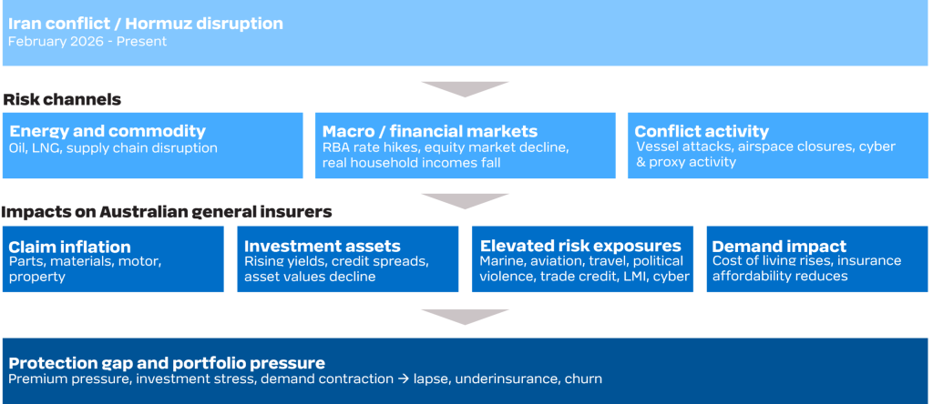
    The 2026 Iran conflict is escalating these pressures through three risk channels simultaneously:

    • An energy and supply chain shock driving broad-based claims inflation
    • Macro and financial market stress impairing investment returns
    • Conflict activity – vessel attacks, airspace closures, cyber threats and proxy operations – generating elevated risk exposures across specialty lines and beyond.

    The real challenge for Australian insurers lies not just in tackling each risk on its own, but in managing the combined impact. Insurer success now hinges on recognising how these risks are interconnected and adapting strategies for a world where volatility is the new norm.
    So, what does this mean for general insurers in practice? We examine how each risk channel is affecting the industry and outline the actions insurers must take to navigate the rapidly changing landscape.

    The conflict flows through three risk channels – each generating distinct impacts on Australian general insurers. The figure illustrates the interplay between these risks and the impacts on general insurers.

    Interaction of risks between the Iran conflict and Australian general insurers

    Now we explore how each of these risks translates into impacts on general insurers in more detail.

    Australian general insurers are facing widespread claims inflation. Australian petrol prices rose around 70 cents per litre to their peak in March with the government’s temporary excise halving clawed back approximately 26 cents, but prices remain around 40 cents above pre-conflict levels. Diesel has climbed above $3 per litre, with the divergence particularly acute for transport, farming, and construction.

    Supply chain disruption adds a second layer. Freight surcharges have been in place since early March, and disruption to global shipping routes is flowing through to the cost of goods underpinning claims – vehicle parts, building materials, plant and equipment. Preliminary ICA data shows cost increases of up to 36% for building materials, 30% for trades and on-site specialists, and 50% for freight.

    The result is broad-based claims cost pressure across almost all classes, driving up average claim sizes and, in turn, premiums.

    Rising energy and supply chain costs are pushing up claims inflation – and the RBA is responding with rate hikes. Higher rates reduce the market value of fixed interest securities. Interest bearing securities comprise over 80% of direct insurer assets* and over 95% of reinsurer assets*. Where duration matching is sound, falling bond values are offset by a corresponding fall in the present value of liabilities but this only addresses the discount rate effect. Claims inflation independently increases the nominal value of future liability cash flows, pressuring the balance sheet from both sides. Inflation-linked bonds offer a partial hedge in principle but limited market depth constrains their use at scale – and CPI may not move in sync with the specific cost pressures driving claims inflation in motor, property, and other lines.

    Beyond liability-backing assets, surplus capital deployed in fixed income or equities has no natural hedge. The ASX fell more than 7% through March. For direct insurers with meaningful equity exposure, the capital impact is even more significant.

    Direct exposure to conflict-sensitive specialty classes for Australian general insurers is limited, with globally mobile risks – including international marine hull, airline aviation war and allied perils, and political violence – largely placed through the London market.

    Impacts are more likely to be indirect. In cyber, the conflict is contributing to an elevated global threat environment, including increased state-linked activity, with potential implications for underwriting and losses. The macroeconomic spillover is also elevating risk in other lines – most notably LMI – where inflation and a tightening RBA bias are weighing on housing demand, with clearance rates at multi-year lows and employment expected to soften.

    Affordability pressure is reshaping customer behaviour across the market in four ways.

    BehaviourCustomer actionInsurer impact
    LapseCancel cover entirely – over 340,000 homes already uninsured, around half citing cost (Australia Institute, 2025)Premium volume falls; portfolio risk composition may shift as customer mix changes
    UnderinsuranceReduce sum insured to lower premium – over 530,000 households already underinsured (Australia Institute, 2025)Shortfall disputes and reputational damage at point of claim
    Product substitutionMigrate to narrower, lower-cost coversRevenue mix deteriorates; coverage adequacy falls across the portfolio
    Active shoppingIncrease comparison activity and churnMargins erode; acquisition costs rise

    Premium affordability and insurability has risen from the sixth most commonly reported business challenge in 2025 to the first in 2026.

         Gallagher Bassett Carrier Perspective: 2026 Claims Insights sneak peek

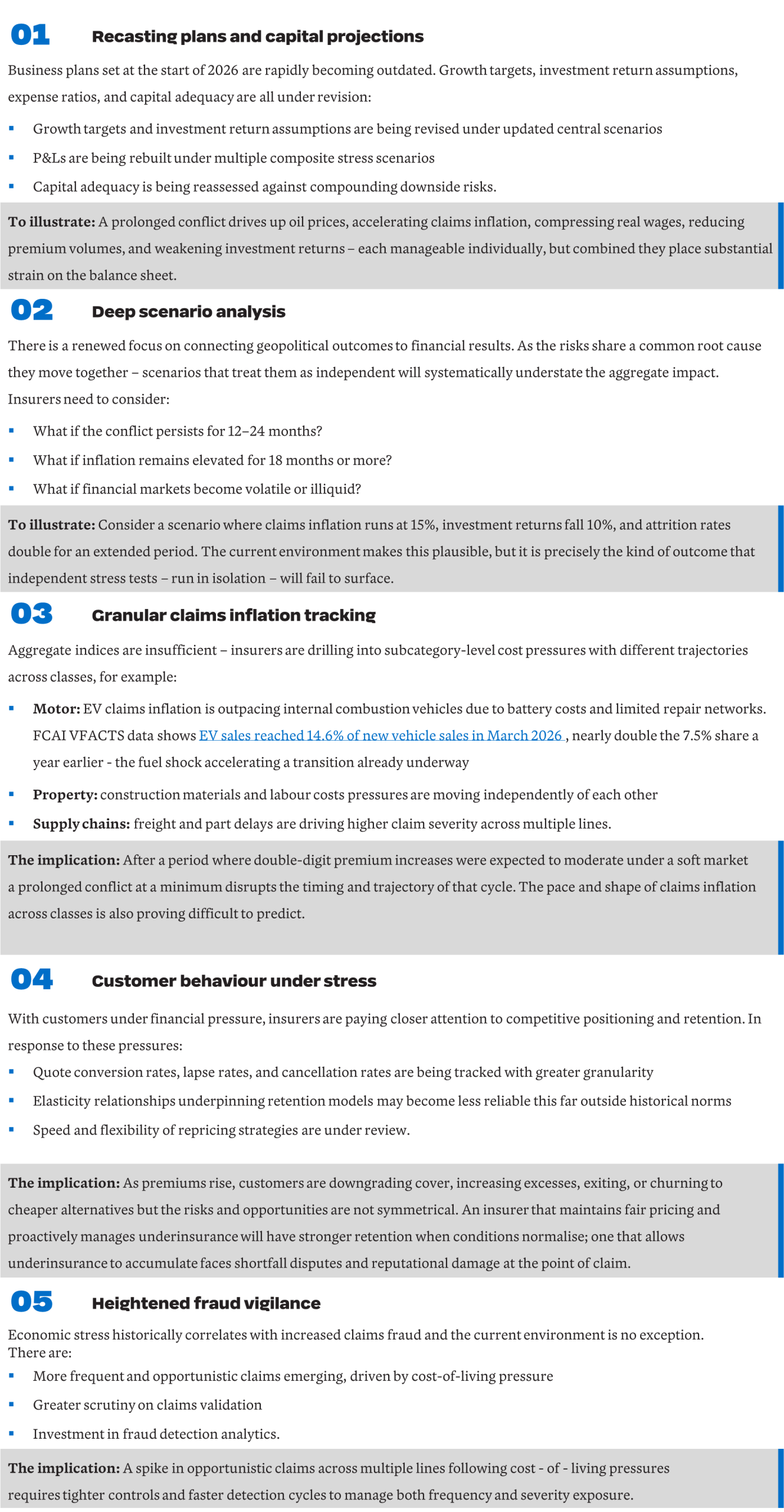
    The conflict is forcing a fundamental reset across planning, capital and operations. Across the industry, five clear priorities are emerging in response.

    Looking Ahead

    Structural shocks that generate correlated, simultaneous pressure across claims, assets, and demand are not a one-off feature of 2026 – they are an increasingly consistent feature of the risk environment. This time it was Hormuz and energy, next time it could be another regional conflict disrupting technology supply chains, a major climate event tightening reinsurance capacity, or something else entirely. The challenge is not predicting the next crisis, it is building the infrastructure and processes to respond rapidly when the next trigger arrives. These include scenario frameworks that can be reoriented quickly, assumptions built to be updated rather than anchored to history, and capital and portfolio positions that are monitored against a range of outcomes. Insurers who invest in this capability now will be better placed to navigate whatever comes next.

    * Based on Taylor Fry’s analysis using the Australian Prudential Regulation Authority’s quarterly general insurance performance statistics for December 2025.
    ** https://www.fcai.com.au/evs-surge-as-buyers-respond-to-fuel-uncertainty/

  • Media release – Taylor Fry wins Best Public Sector Evaluation

    Media release – Taylor Fry wins Best Public Sector Evaluation

    The Australian Evaluation Society awarded our team, along with our partner ARTD Consultants, for their large mixed-method study centred on suicide prevention. Working with NSW Health, we evaluated six new initiatives that were part of the Government’s Towards Zero Suicides suite.

    The Best Public Sector Evaluation recognises “exemplary evaluation work conducted within the Australasian public sector that has been used to effect real and observable changes in policies or programs”. Led by Hugh MillerRamona Meyricke and Dennis Lam, the resulting report linked state and Commonwealth data, offering a rare system-wide view of suicide prevention efforts in NSW.

    Hugh Miller accepting the award at the AES event and after the win, with Dennis Lam

    The six programs evaluated form part of the NSW Ministry of Health’s Towards Zero Suicides initiatives – a $2.9 billion, multi-year investment in mental health services. The Australian Evaluation Society (AES) said the work “strongly demonstrated change and contribution to knowledge at a broad scale”, including “practical tools and frameworks [to] guide future evaluation practice”. Our report was strengthened, it said, by the embedded nature of diverse experts, such as an Indigenous reference group and people with lived experience.

    On accepting the award on behalf of Taylor Fry, Hugh said, “It was a long and sometimes challenging project but we delivered something pretty special. I’m particularly proud of the use of longitudinal linked data, as a way of understanding what happens to people before and after accessing a service or program, crucially important in this space.”

    He said the evaluation also demonstrates that suicide prevention is everybody’s business. “More than half of the people who die by suicide do not have a suicide-related or mental health interaction with Commonwealth or state health systems in the year prior to death. This means that achieving large reductions in deaths also requires investment in strengthening our communities, looking out for the vulnerable and isolated, and ensuring our non-health government services are run in ways that are not harmful. Tough but worthy work.”

    For a summary of the evaluation, view our article, NSW Ministry of Health releases Taylor Fry report.

    Read the report in full – the overarching report Evaluation of Suicide Prevention Initiatives or the brief  Summary Report.

    Visit the Australian Evaluation Society for more on the Best Public Sector Evaluation Award.

  • RADAR FY2025 – Balance and meaningful action vital amid huge wins

    RADAR FY2025 – Balance and meaningful action vital amid huge wins

    What are the big themes for insurers following another year of record-breaking profits? In RADAR FY2025, Taylor Fry offers key insights on how to navigate the shifting landscape, with its greater focus on transparency and customer experience, increasing AI adoption and the ever-present risks of an evolving climate.

    The general insurance industry has again posted its strongest result in more than 10 years with a profit after tax of $7.3 billion over the 12 months to 30 June 2025, according to recent data from the Australian Prudential Regulatory Authority (APRA).

    While we expect the escalating figures will intensify focus on pricing practices and fairness, we stress the importance of perspective through a long-term view in our latest class-by-class analysis of the sector, RADAR FY2025.

    Dive into RADAR FY2025 for a raft of expert analysis, reader-friendly charts and insightful videos covering the major happenings, emerging trends and impacts for insurers.

    Here’s an overview of some of the key themes you’ll find at our RADAR FY2025 hub …

    Volatility vs the long-term view

    “Understandably, consumers may question the big result in a time of ongoing cost-of-living and insurance affordability pressures,” principal Scott Duncan says. “But insurance is naturally a volatile business year on year and it’s critical not to view profits solely from a one-year window. Insurers were hit particularly hard during COVID.”

    This experience is reflected in the share price of the larger insurers. “The share price for Suncorp, IAG and QBE have increased at twice the rate of the broader market since 2020. Yet when we take a longer-term view, over the past 10 years, we see their share price has matched the broader market.”

    Scott says this short-term volatility but steadier, long-term picture demonstrates the core role of insurance. “Insurance acts as a shock absorber for households and the broader economy to ensure the sector can restore community when times are bad.”

    Opportunities for the taking

    A run of positive experience over the past two years, however, provides the industry with vital opportunities to reflect and invest purposefully in better serving customers. “Previously, insurers reported years of muted returns through extreme weather events and COVID-19, with sustained losses in the householders class,” he says. “Supported by robust bottom lines, investing in customer relationships now will be the defining strategy to secure long-term trust and loyalty.”

    “Investing in customer relationships now will [lead to] to long-term trust and loyalty.”

    The response to Cyclone Alfred, Scott says, is a good example of a customer-first approach. “Insurers provided specialist response teams, which resulted in faster claims handling and improved communication with customers.”

    The industry is also investing heavily in AI to improve underwriting and claims processes. “We’re seeing claims assistants summarising product disclosure statements and recommending next best steps for claims managers,” Scott says. “On the underwriting side, AI is being used to obtain relevant information, reducing the information collected from customers.”

    What’s driving the big result

    Looking at the figures, RADAR FY2025 shows direct insurers recorded a $6.7 billion profit after tax, the highest on record, driven by several factors, including catastrophic losses coming in below expectations, several years of double-digit premium increases, strong investment returns and reserve releases.

    Insurers will need to place the customer at the centre of proactive initiatives … to help foster policyholder loyalty and confidence in their insurer to do the right thing when it counts the most.

    Scott draws out householders, domestic motor and a softening market as key highlights across the underwriting result. “While householders recorded an insurance service result of $1.16 billion – the strongest in more than 10 years – APRA data shows a continued decline in risks written over 2025, with evidence that consumers who retain insurance are increasing excesses to offset cost-of-living pressures,” he says.

    Signs of a softening market

    With strong signs of a softening market, balancing growth and profitability objectives in the near term will be challenging. “Insurers will need to place the customer at the centre of proactive initiatives, such as focusing on a seamless acquisition journey or ensuring people are not left with inadequate cover.

    “These types of moves will help to foster policyholder loyalty and confidence in their insurer to do the right thing when it counts the most.”

    For reinsurers, who recorded a $0.6 billion profit after tax – the second highest in the past 10 years – the market is also softening, Scott says. “The pricing and risk selection discipline shown over the past few years will come under challenge.”

    Climate and extreme weather

    With access, affordability and transparency in the spotlight, climate issues, as ever, are adding extra pressure. Scott says, “The recently released National Climate Risk Assessment confirms Australians will continue to experience climate hazards with widespread, cascading and compounding impacts that will reshape risk and influence insurer profitability.”

    The National Climate Risk Assessment confirms climate hazards will reshape risk and insurer profits

    Additionally, new technologies and business practices relating to the energy transition will further redefine risk and profitability. “Australia has set records in 2025 in terms of battery storage growth, electric vehicle sales and installed solar power capacity, presenting relatively new risks to the industry.” More risks will emerge as the energy transition progresses, Scott adds, which increases the importance of underwriting decisions and portfolio risk monitoring across many classes of business.

    Eye on the future

    Scott believes pricing transparency will be high on the agenda ahead, as demonstrated by ASIC’s recent focus on how insurers communicate year-on-year changes in premiums to their customers. “Insurers can take action now to improve fairness and transparency, such as giving home insurance policyholders premium reductions for actions they take to improve a property’s resilience.”

    AI adoption at pace will continue for some time, as insurers aim for quicker and more consistent outcomes for customers. “The focus is now switching to AI governance, data security and cyber risk management,” he says. “The more agile insurers will not only protect customers with appropriate guardrails but ensure fair treatment. Empathy and critical thinking are crucial here, especially for the most vulnerable customers.

    “Taking time now to reflect on how to elevate customers’ experience, truly understand their needs and take proactive steps to build more trust will be critical in securing a strong foundation for the future.”

    For more details, or to arrange an interview with Scott Duncan, please contact:

    Elizabeth Finch | +61 473 848 888

  • NSW Ministry of Health releases Taylor Fry report

    NSW Ministry of Health releases Taylor Fry report

    We evaluated a suite of NSW Government suicide* prevention initiatives, which form part of the state’s $2.9 billion investment in mental health services. By linking state and Commonwealth data, our evaluation offers a rare, system-wide view of suicide prevention efforts in NSW – revealing positive impacts as well as opportunities to improve health responses and community resilience.

    The NSW Ministry of Health recently published our evaluation of six programs under the state’s Towards Zero Suicides initiatives – a multi-year effort to reduce suicide and its devastating impact on individuals, families and communities.

    Led by Taylor Fry’s Hugh Miller, Ramona Meyricke and Dennis Lam in collaboration with ARTD Consultants, the evaluation brings together a diverse mix of evidence – including linked administrative data, interviews with stakeholders and consumers, surveys and program-level data – to understand how the initiatives are operating and where they can be strengthened.

    The six initiatives span the full spectrum of suicide prevention supports:

    • Safe Havens
    • Suicide Prevention Outreach Teams
    • Zero Suicides in Care
    • Community Gatekeeper Training
    • Post Suicide Support
    • am/ Youth Aftercare.
    The initiatives reach those who weren’t accessing support or who otherwise wouldn’t have reached out

    Initiatives critical in connecting people

    Our evaluation found the initiatives are reaching thousands of people across NSW – including those who may not otherwise have sought support. In some districts, more than 40 per cent of Safe Haven visitors reported they would not have sought help had the service not been available. This highlights the critical role these initiatives play in connecting with people who may fall through the gaps in traditional care pathways.

    Linked data key in understanding patterns of service use

    A key strength of the evaluation was the use of linked administrative data across NSW Health and Commonwealth systems – including emergency, inpatient, mental health, MBS and PBS records. This enabled a more complete view of service pathways before and after engagement with the initiatives, and broader patterns of service use prior to self-harm or suicide. For example, the evaluation found only one-third of people who died by suicide had a recorded interaction with NSW Health mental health services in the year prior to their death. These insights are helping to build a clearer picture of where the system is working well – and where there are opportunities to strengthen access, coordination and follow-up care.

    Positive outcomes and service gaps

    In terms of outcomes, consumers reported high satisfaction and reduced distress, particularly those accessing Safe Havens, Youth Aftercare and Post Suicide Support. In some districts, Safe Havens were also associated with fewer emergency department presentations for suicidal ideation. At the same time, the evaluation identified important service gaps – and opportunities to improve data capture, referral pathways and access for priority groups, including older people, men and LGBTQIA+ communities.

    For more details, read the overarching report Evaluation of Suicide Prevention Initiatives, or the brief  Summary Report.

    *The pain and loss of suicide for those who take their lives and the loved ones they leave behind affect thousands of people each year in Australia. If this article raises concerns for you, please contact Beyond Blue on 1300 22 4626, Lifeline on 13 11 14 or seek help from these crisis helplines and support services.